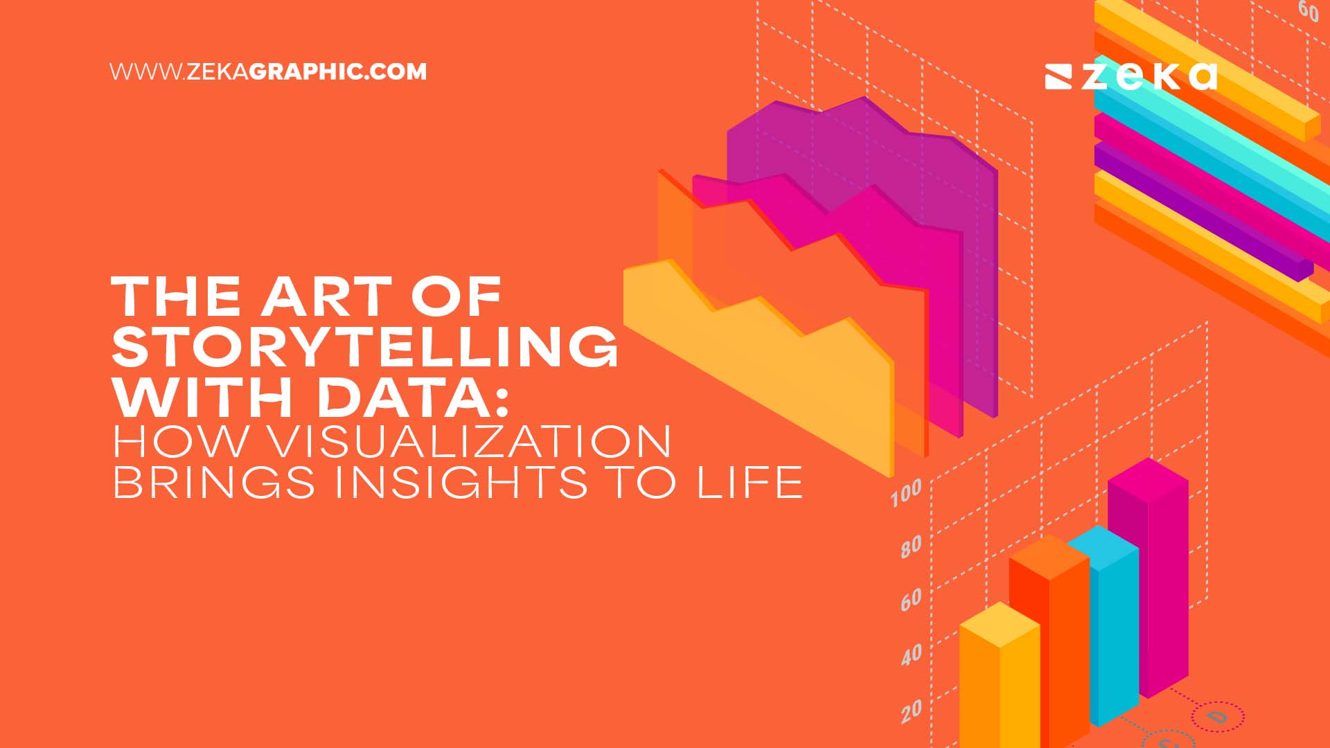
Data storytelling is a way of communicating information tailored to a specific audience with a compelling narrative. You might be presenting a highly complex data set and with your data visualization skills, you should make such choices that help your stakeholders better comprehend the data you have collected.
In other words, your data visualization skills should not confuse your audience even further. Storytelling with data requires narrative skills that allow you to convey observations, communicate wins, or create urgency for projects that are not performing well.
Join us while we explore the ins and outs of data storytelling and visualization, key techniques and concepts, and common challenges.
Advertisment
Presenting raw, untouched data is useful to only a handful of individuals who understand numbers without added context. That’s where data storytelling comes into play.
It helps you take plain, uninteresting numbers and present them contextually and engagingly so your audience can easily relate, and follow them.
In other words, you use this process to craft a narrative around complex data and visualization to shed light on emerging trends, crucial metrics, and valuable insights.
The end goal of data storytelling is to make all that obscure data more accessible and digestible, even if your audience is not tech-savvy.
Data storytelling holds a great deal of benefits for organizations, and some of the most prominent are:
Chances are you’ve already seen dozens of applications of data storytelling in real-life scenarios, such as healthcare projections and vaccination percentages during the COVID outbreak, or visualized representations of climate change impacts.
Before creating a narrative, first, determine who will interact with your data. Decision-makers, stakeholders, and end-users will all have different levels of familiarity and interest in the subject matter. Your message will be successfully transferred by understanding the presentation style and topic.
Here are some questions you should ask your audience:
Getting to know your audience ensures you’ll choose the appropriate medium, message, and tone for your presentation. For businesses handling large datasets, working with an Excel consultant can help streamline data organization, automate repetitive tasks, and create structured reports tailored to the audience’s needs.
Here’s how a data story works: first, it needs to have structure. Then, you introduce a problem, state evidence through data, and then wrap up with insights or recommendations.
Using relatable scenarios and explaining the situation concisely allows readers to understand and also take action.
The narrative must strike a balance between simplicity and depth so as not to overwhelm or over-simplify.
Creating a compelling story requires you to take several steps:
Following such a format, your story will not only inform but also drive meaningful engagement and action. Your message will come across as cohesive and persuasive, no matter the target audience.
Advertisment
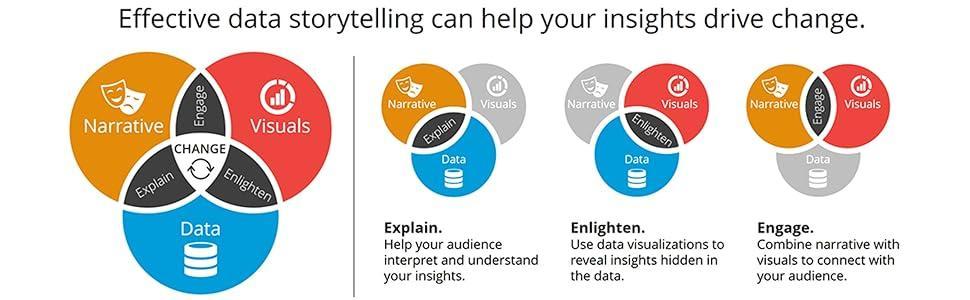
People often think of data visualization as being the same as data storytelling. In reality, visualizations are a part of data ta stories that serve as an aid to paint a broader picture.
They help deliver certain points by using graphical elements like maps or graphs to make to narrative more relatable. Your skills in conveying your data visually directly correlate with your ability to gain interest and leverage the data in your favor.
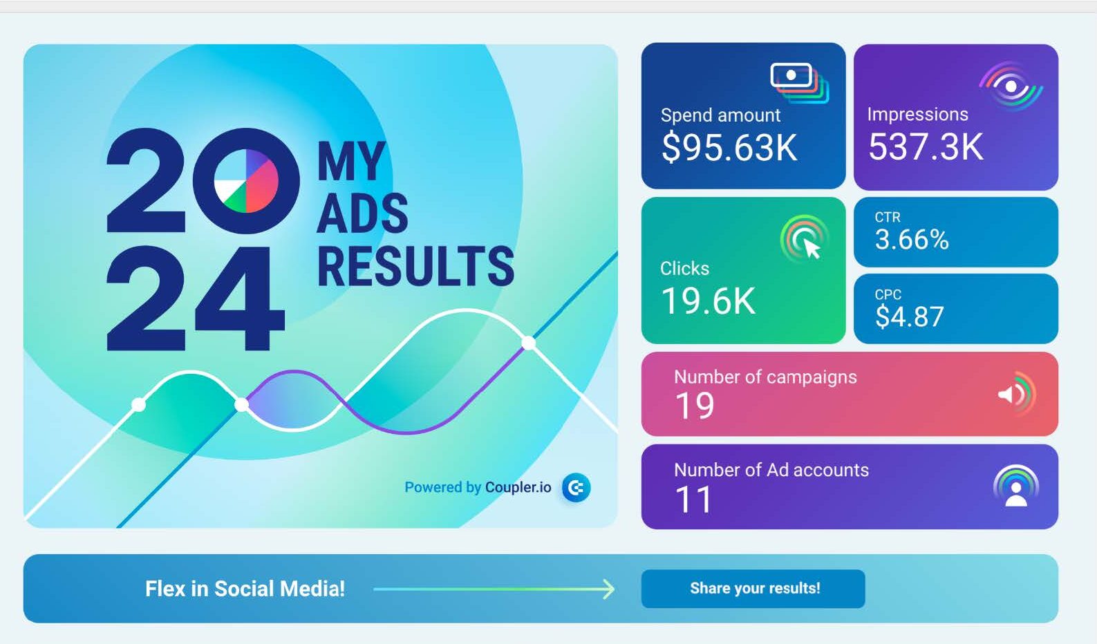
Most of your data can be demonstrated through dashboards. These tools are used as a way to organize and showcase crucial content, that connects the data with the narrative. Dashboards have several advantages:
With ready-to-use solutions like Power BI dashboards templates you can establish a process that offers pre-designed visualizations for conveying your story.
Advertisment
Data storytelling techniques for crafting impactful stories go beyond presenting numbers. A well-told story focuses on making data understandable, engaging, and relevant to its audience.
Achieving this requires a combination of strategies that highlight important details, simplify complex matters, and keep attention throughout the presentation.
One critical way is to focus on the most important measures and insights while minimizing distractions.
Breaking down large datasets into smaller, more digestible pieces is another way to do it. This way, the information will not be overwhelming, and the audience will be able to follow the story step-by-step.
These segments are then supported with brief annotations or explanations that bridge the gaps in understanding, making the narrative cohesive and easy to follow.
Pacing is equally important: too, too fast is a surefire way to see your audience become disengaged, or critical information misunderstood. Showing each point in turn allows for adequate reflection on the presentation data, as well as securing maximum attention.
If you want to keep your audience engaged with the art of storytelling you should:
AI expedites data storytelling through its ability to analyze large volumes of information at high speeds and detect and present patterns from them.
It suggests the most appropriate ways of showcasing data to communicate them most clearly. During this process, thanks to AI’s ability to smoothen this operation, workflow time and effort are spared for you to come up with an engaging and interesting story.
Additionally, data archiving solutions can ensure that historical datasets remain accessible for future analysis, allowing organizations to build richer, more informed narratives over time.
Even those experienced in data visualization and storytelling can end up making some mistakes along the way. In this section, we’ll sift through the four most common challenges you can face, and propose solutions to avoid them.
Advertisment
Storytelling with data allows you to create a bigger impact, and improve the memorability and persuasiveness of your reports.
With data visualization, you can promote change within the company, inform your stakeholders, and inspire action whenever needed.
Implementing the techniques we’ve discussed in this article helps you create a better understanding of the work you’re doing and the impact it has on the organization while improving communication processes.
Advertisment
Pin it for later!
If you found this post useful you might like to read these post about Graphic Design Inspiration.
Advertisment
If you like this post share it on your social media!
Advertisment


Want to make your Business Grow with Creative design?
Advertisment

Advertisment