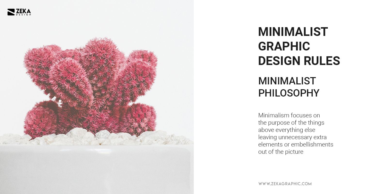
To better understand what minimalism is, it is important to know that it’s not only a style or trend, minimalism is a way of life that can be adapted to how you dress, how you design your house, or how you are living. Minimalism focuses on the purpose of the things above everything else leaving unnecessary extra elements or embellishments out of the picture.
As we already know what is minimalism, it also can be adapted to graphic design. Minimalist graphic design style focuses on the function over visual and following graphic design principles creates a simple but harmonious design and clear composition focused on the most important where there is no room for extra elements which can distract you from the focal point.
The minimalist design as we know nowadays was born in the late 1960s to early 1970s in American visual art, but we already can spot traces of minimalism in early graphic design styles but we need to go back many years to see minimalism as philosophy and artistic movement.
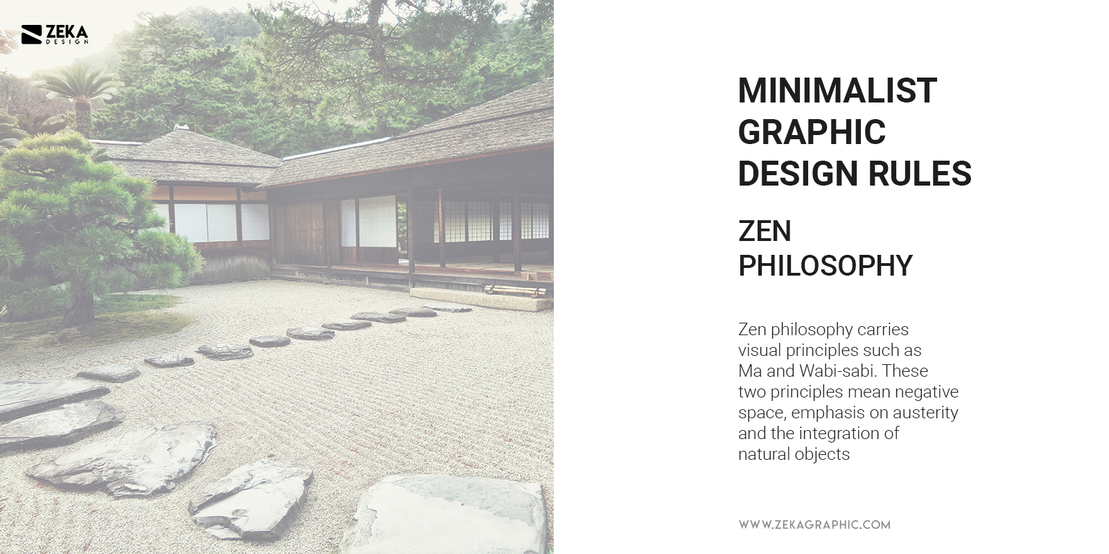
If you look in any Japanese house you will spot minimalist design and that is because the Japanese Zen Philosophy which dates back to the 12th century, Zen philosophy carries visual principles such as Ma and Wabi-sabi. These two principles mean negative space, emphasis on austerity and the integration of natural objects, visual principles you easily can relate to minimalist graphic design style.
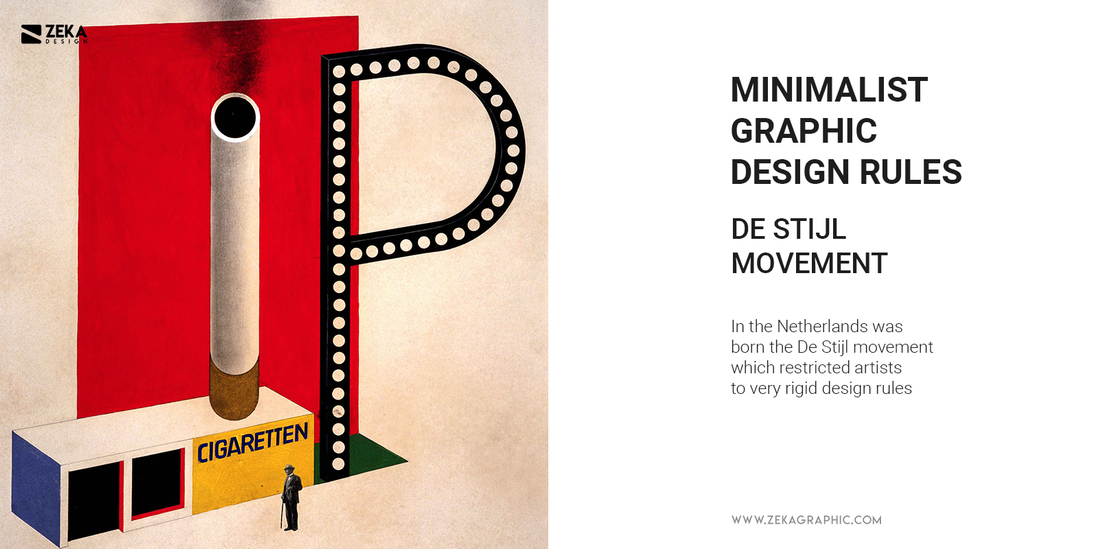
If we go back to the 20th century we can already spot the first minimalist influences in graphic design and art. In the Netherlands was born the De Stijl movement which restricted artists to very rigid rules, at the same time in Germany we can spot the iconic Bauhaus movement. Bauhaus artists are known for experimenting with geometric abstraction and their main motto was “form follows function”.
All these European design styles influenced artists from the USA which led to the creation of American Minimalism which focuses on the most essential graphic elements removing decorative elements focusing on the main information.
Once we already know what is Minimalism and the history of minimalist design style, we can see the 8 rules of minimalism in graphic design.
Advertisment
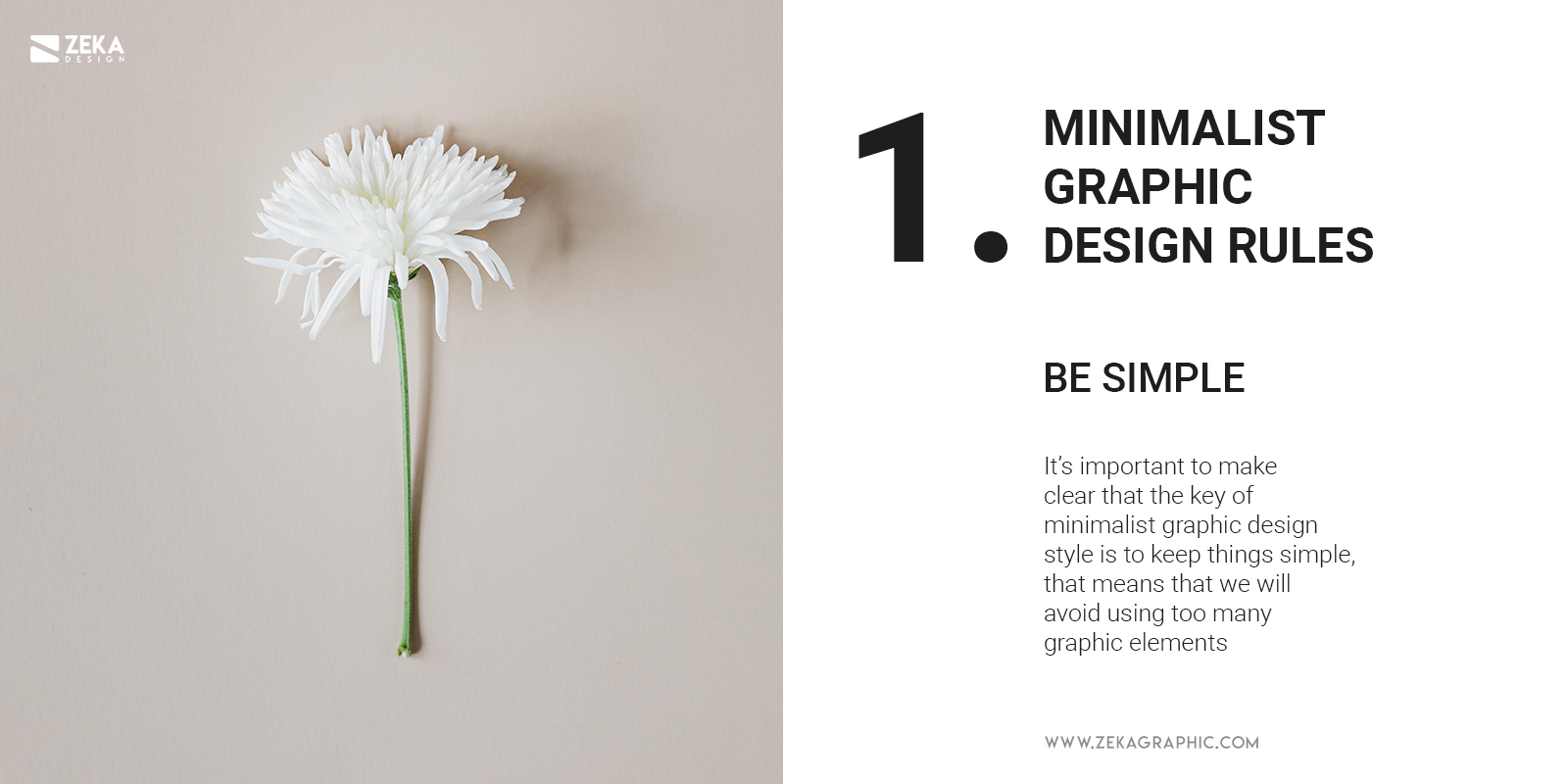
This first one might be obvious knowing the minimalist philosophy, but it’s important to make clear that the key of minimalist graphic design style is to keep things simple, which means that we will avoid using too many graphic elements in our design project restricting our design in one or two maximum fonts, relaxed and short color palette and only putting in our design the necessary information.
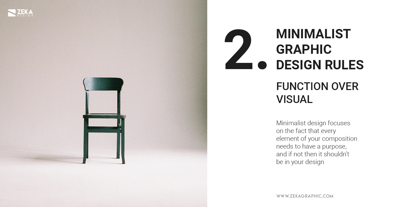
As we already know that Minimalism philosophy makes a big focus on the function we also can apply that in Graphic Design by prioritizing the content and accessibility over the visual look of our design and decorative elements. Minimalist design focuses on the fact that every element of your composition needs to have a purpose, and if not then it shouldn’t be in your design, so be very careful by choosing your graphic elements.
Advertisment
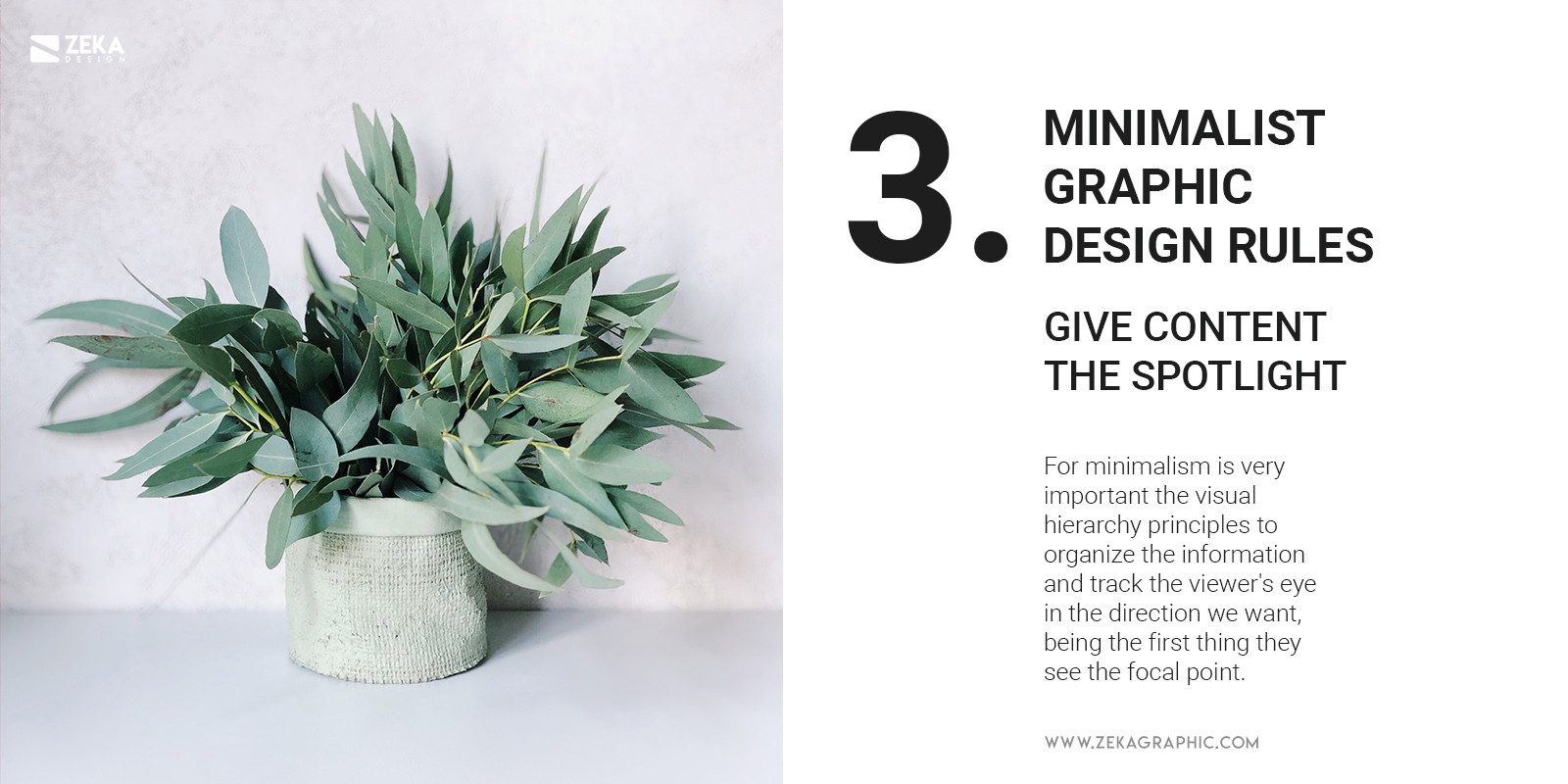
If you want to create a minimalist graphic design project then the first thing that you see on your design it’s the content and the information you want to transmit. For minimalism is very important the visual hierarchy principles to organize the information and track the viewer’s eye in the direction we want, being the first thing they see the focal point. We can achieve this by playing with typography, color, and composition creating contrast, but if you want to have a deeper look at what is visual hierarchy and how to use it I have a post dedicated to it!.
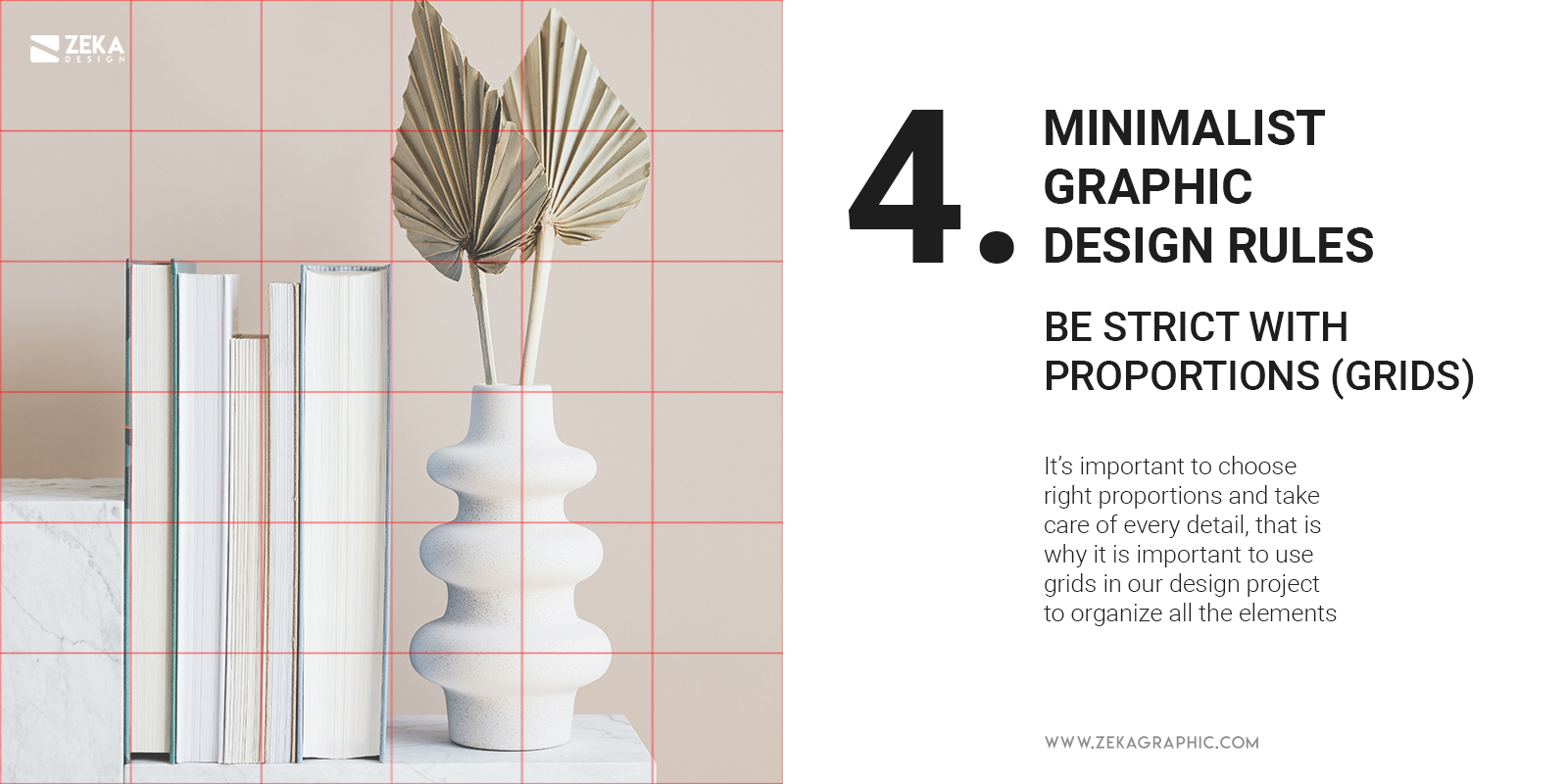
In minimalist graphic design as we are using a small number of graphic elements it’s important to choose the right proportions and take care of every detail, that is why it is important to use grids in our design project to organize all the elements on a graphic layout to make it easier for the viewer to identify the main information.
Designing with grids make it easier for graphic designers to keep your design clean and aligned correctly, you can use the rule of thirds or explore other grid compositions and being creative with them, if you want to learn more about grids in graphic design, I talk about Grid Systems in Graphic design book in my top 10 best books for graphic designers.
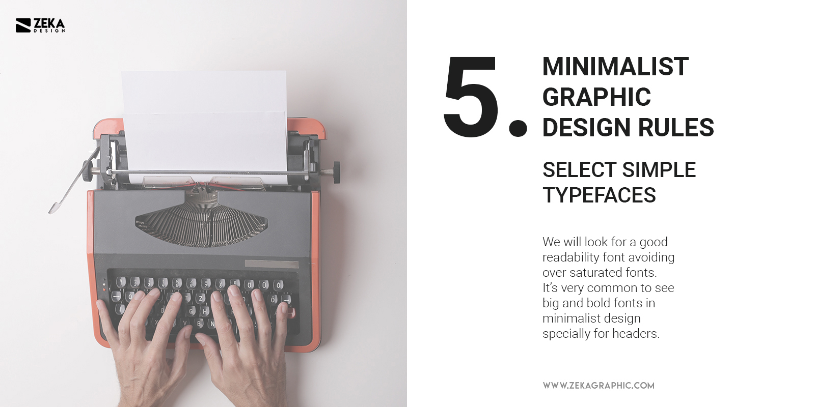
Typography is very important in graphic design, but it is more important in minimalist design style due to the small number of graphic elements which we will use in our project being font one of them. Remember what I said on the second point? function over visual, that is also applicable to choosing the right font, we will look for a good readability font avoiding over oversaturated fonts.
It’s very common to see big and bold fonts in minimalist design especially for headers, as their readability is very good for the viewer and focus your eyes on it, so for typeface, we will choose a clean and straightforward font without any decorative elements.
Advertisment
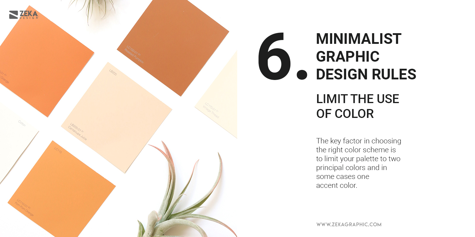
Talking about the color palette in minimalism graphic design, many people think you can only use black and white, but that is not true. You can still use a black and white color combination, but the key factor in choosing the right color scheme is to limit your palette to two principal colors and in some cases one accent color.
You can experiment with different color combinations in minimalism design using a two-color palette or go monochromatic and avoid using color gradients and stay on flat design. And remember that every element in our design composition needs to have a meaning and function, so be intentional with your color selection.
Advertisment
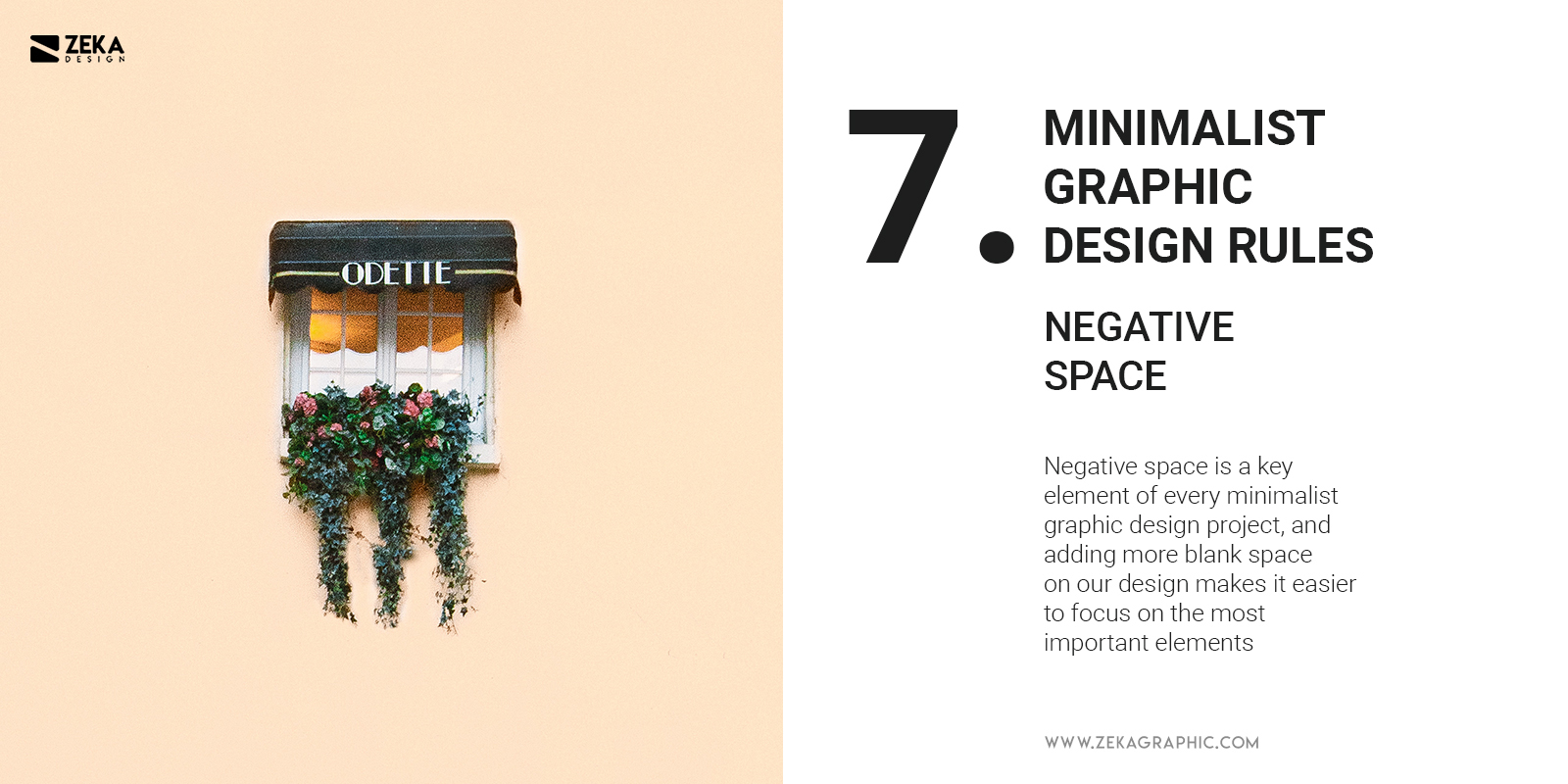
Remember when we talk about function and simplicity in minimalism?, we need to avoid extra elements without purpose and keep the minimum amount of graphic elements in our composition, but we can still play with Negative space as a design element.
Negative space is a key element of every minimalist graphic design project, and adding more blank space on our design makes it easier to focus on the most important elements from our composition because we give them room to breathe.
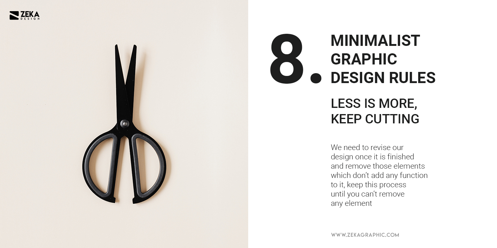
The key principle of minimalism is to focus on important elements and avoid the use of decoration without any function, that is why we need to revise our design once it is finished and remove those elements which don’t add any function to it, keep this process until you can’t remove any element, and once you arrive to that point that will mean that all the elements from your design have a function and are important.
Advertisment
I hope you find this guide about minimalism graphic design useful and will help you in your future graphic design projects by focusing on the important elements of it and keeping your design clean and functional. If you want to learn more about graphic design I recommend you these posts.

If you found this post useful you might like to read these post about Graphic Design Inspiration.
Advertisment
Written by
If you like this post share it on your social media!
Advertisment
Advertisment