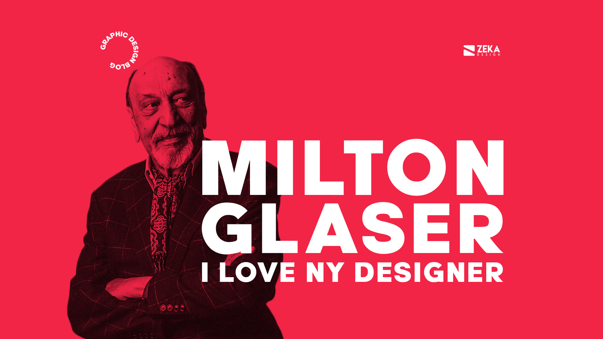
On this post I will talk about one of the most iconic Graphic Designers in history, New York-born designer Milton Glaser, I will show you his biography, the most iconic Milton Glaser Works and analyze his graphic design style.
Advertisment
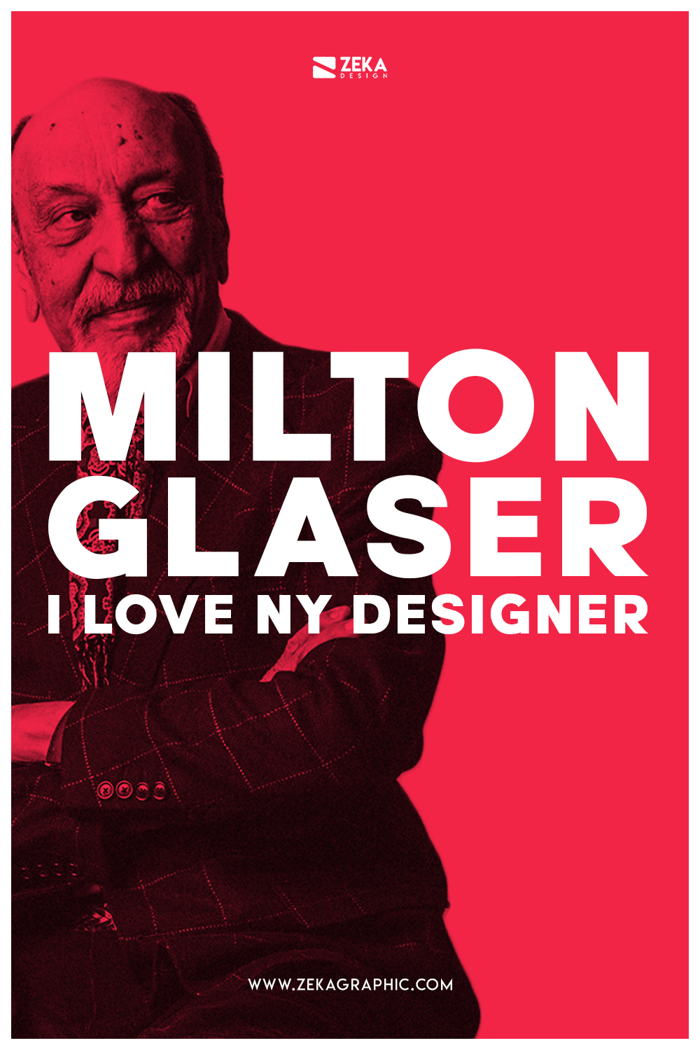
Milton Glaser born on June 26, 1929, in Bronx, New York and was an American Graphic designer, illustrator and co-founder of Pushpin Studio. His design works were exhibited on Musem of Modern Art and prestigious Georges Pompidou Center at the same time he is the graphic designer behind the most trended logo design of the century, I ♥ NY, some of his most prominent design projects are DC Comics bullet Logo and Bob Dylan poster design among many other that we will see later on this post.
He graduated in High School in Cooper Union School of Art in New York City and earned a Fulbright Scholarship to study at the Academy of Fine Art in Bologna, Italy in 1952 where he studied printmaking with iconic artist Giorgio Morandi. Back in New York, he founded the Graphic Design agency Pushpin Studio in 1954 with Edward Sorel, Reynolds Ruffins and Seymour Chwast.
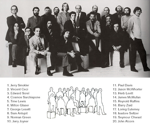
Pushpin Studio was in the vanguard movement who opposed the austere modernism, Pushpin studio artists were influenced by their childhood love of comic books and modern art learned from their student days, all these ideas were merged to create an innovative and conceptual approach to Graphic Design. The Pushpin Studio included fine art and commercial art projects and due to their innovative work process in graphic design, the studio earned an international reputation during the 1960’s and 70’s. and some of their works were exhibited in the Musée des Arts Decoratifs in Paris.
During these years Milton Glaser and Seymour Chwast were highly involved in typography design and total design process of visual communication, as early mention the Pushpin Studio innovative work process approach consisted on one designer creates the total design, including the creation of the concept, overall page design, typeface or lettering and image for the project this working method assures that the designer is part of the process at every stage of the design.
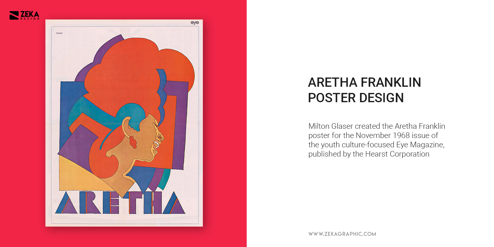
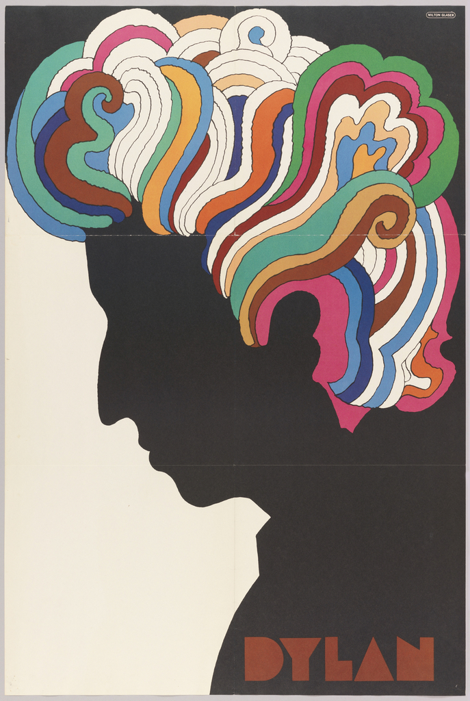
Thanks to this innovative work method inspired by Art Nouveau-era poster artist as Jules Chéret or Henri Toulouse-Lautrec make Milton Glaser design some iconic design projects as Bob Dylan poster design for his new record album in 1967, this poster design became a cultural icon and he used countered lines and flat color to create this iconic design at the same time that he used his own typeface called Babyteeth on this design to spell out Dylan’s name on the poster, this design has art nouveau inspiration characteristic that shares with Psychedelic Poster Design Father Wes Wilson. Another interesting design work of Milton Glaser in that days was the Aretha Franklin Poster made in 1968.
Advertisment
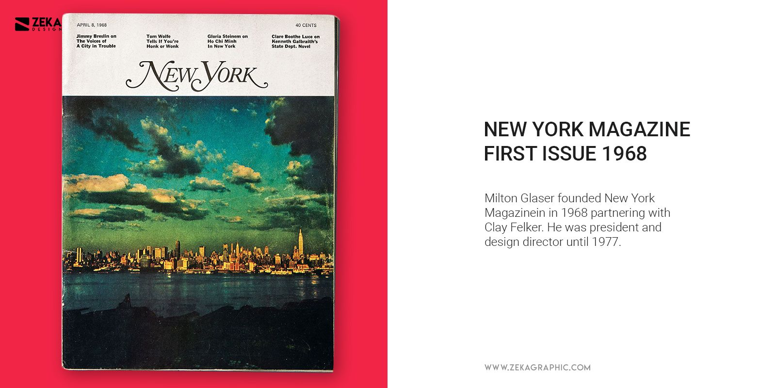
After his exhibition on Musée des Arts Decoratifs at Paris Milton Glaser left Pushpin Studio to focus on new graphic design projects and in 1968 partnering with Clay Felker, he established New York Magazine where Glaser was president and design director until 1977 and this magazine became a great inspiration for other city publications who get inspired by New York Magazine design and style.
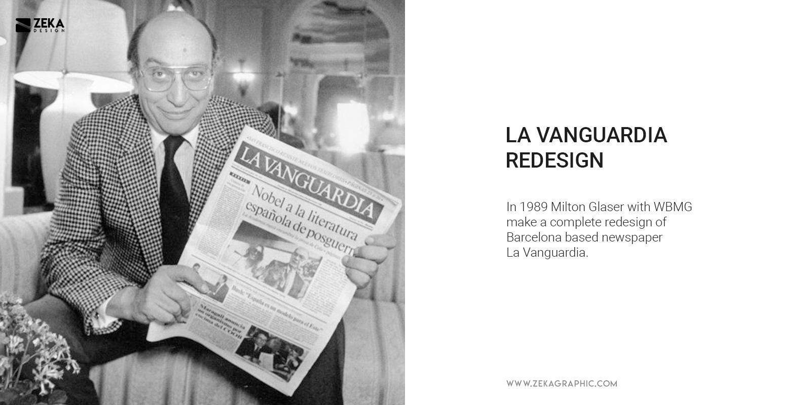
In 1983 Milton Glaser teamed with Walter Bernard to create WBMG, a New York-based publication and editorial design firm and during the creation of WBMG they designed more than 50 different magazines and they are responsible for making the complete rebranding project for three major newspaper, The Washington Post in The US, La Vanguardia in Barcelona and O Globo in Rio de Janeiro. Some of the most prominent design works of WBMG include consulted on design for New York Daily News, the redesign of L’Express, Lire, a french magazine, L’Espresso redesign in Rome and Business Tokyo in Japan.
Advertisment
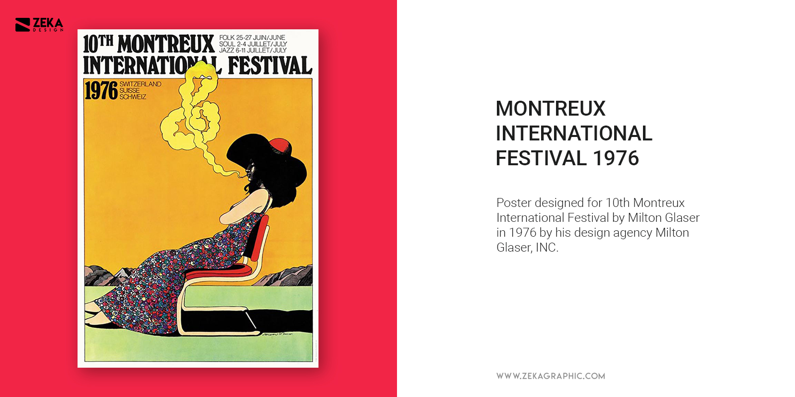
While he was working for WBMG he founded his own design agency Milton Glaser, Inc in 1974 based in Manhattan, and his studio has a wide range of design disciplines including print graphic design, brand and identity programs for corporate and marketing purposes including logo design, stationery, brochures, etc and he is responsible for creating corporate identity design for many top corporations. Alongside brand and identity projects Milton Glasser has done over 300 poster design for clients in different areas as music, publishing, theatre, film or commercial products.
Milton Glaser, Inc. is also known for their environmental and interior design services and they are responsible for conceptualizing and site-supervise the fabrication of many products, exhibitions, interiors and exteriors of restaurants, shopping malls, hotels and other commercial environments.
Some of the most important clients of Milton Glaser, Inc. includes Target, Eleven Madison Park, Brooklyn Brewery, The Rubin Museum of Art, JetBlue, the logo for the state of New York, and the list goes. Milton Glaser’s artwork and design projects have been shown worldwide and exhibited in several museums during the late 1980s.
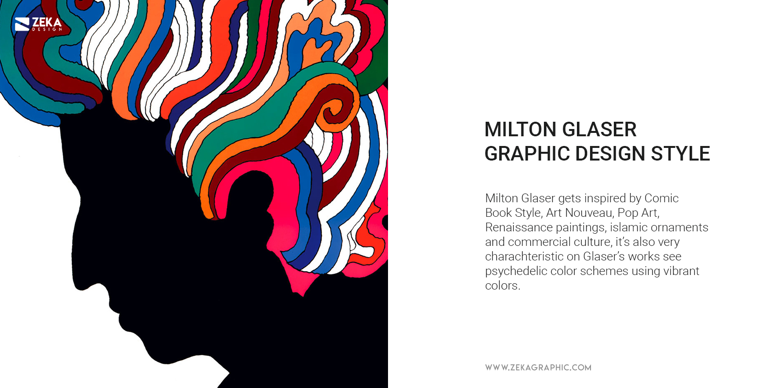
Milton Glaser graphic design style is very characteristic and if you analyze his design works you can see a playful graphic design style alongside humorous vocabulary inspired by his childhood love of comic books and the big use of psychedelic color schemes with vibrant colors and big contrasts. Milton Glaser design inspiration are as already said the comic book style, he was really interested on art nouveau style as also was Wes Wilson, and he also found inspiration in a Renaissance painting, Islamic ornaments, pop-art design style which was growing up and commercial culture.
Advertisment
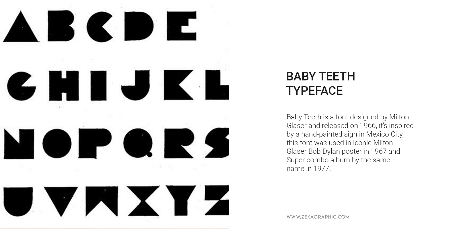
As we already have seen on this post Milton Glaser starts to get more involved on typography design on 60’s when he was a co-founder of Pushpin Studios, and during his graphic design career, Milton Glaser has designed several fonts which he included in his graphic design projects. Maybe his most known font is Baby Teeth released on 1966 and inspired by a hand-painted sign in Mexico City, this font was used in iconic Milton Glaser Bob Dylan poster in 1967 and Super combo album by the same name in 1977.
Glaser Stencil was also a font designed by Milton Glaser alongside with Geroge Leavitt and Michael Doret and released on 1969, it’s also known as Neo Futura and you can see this typeface in AC/DC High Voltage and Poster Design for the Olivetti Valentine typewriter.
Other fonts and typefaces designed by Milton Glaser are Filmsense, Baby Fat, Einstein, Coochie Nando NF, F37 Glaser Stencil, Baby Curls, Big Kitchen, Aint Baroque NF, Glaser Houdini and Rainbow.
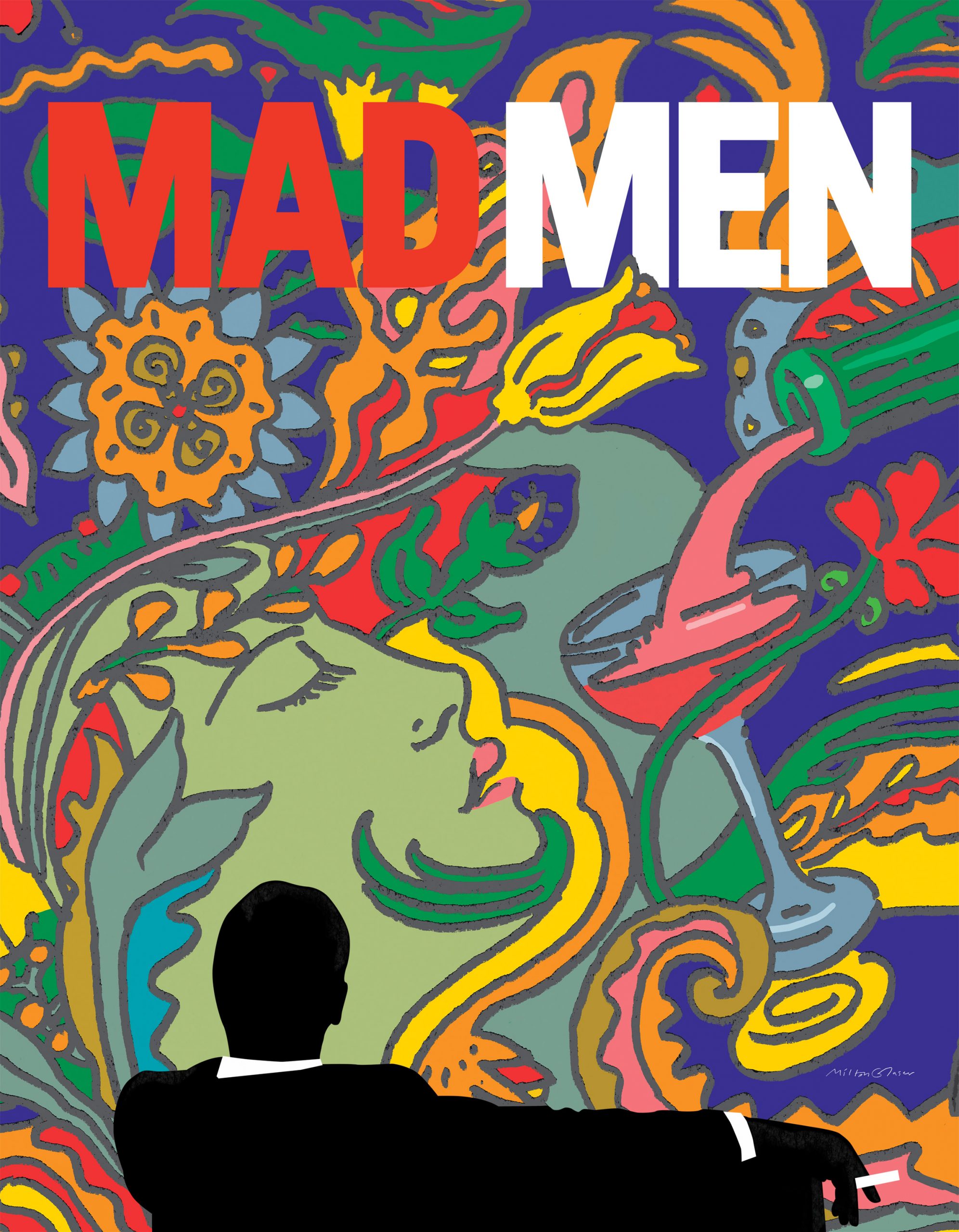
The last season of Mad Men television series was advertised using a series of Art Nouveau-style poster designs and animations designed by Milton Glasser in 2014. The poster for the final season of this American Dram features the silhouette of the Don Draper, the protagonist of the series alongside an illustration of a woman’s head next to a glass filled with a drink in an art nouveau style.
We already have talked about this poster on this blog post and now let’s take a more deep look at him, it was designed in 1967 for Bob Dylan’s Greatest Hits album and this project led Milton Glasser to international fame as Graphic Designer. The idea for this poster is inspired by a self-portrait of Marcel Duchamp and it features Dylan’s side illustrated in black silhouette contrasting with the rainbow colored Dylan Hair.
As early mentioned on this post, Milton Glaser and Clay Felker founded New York Magazine in 1968, and as you imagine Milton Glaser designed the iconic curly logo design for the life, culture, politics and style magazine at the same time that he also designed a series of posters to promote the publication of it titled New York is About New York.
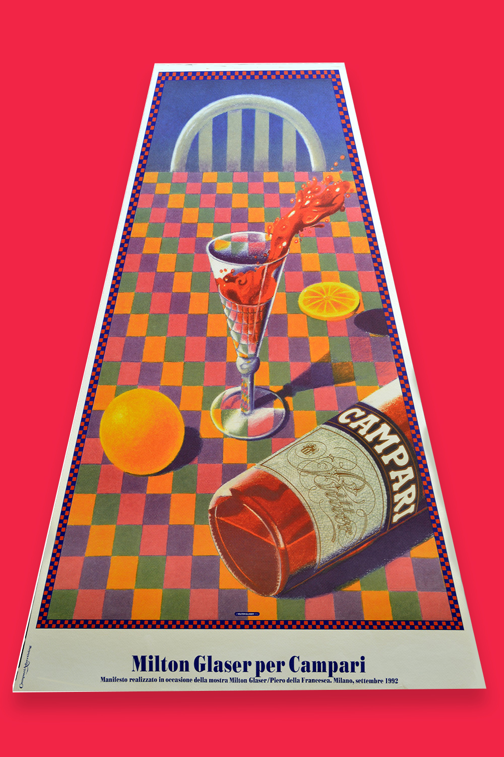
Campari is an Italian alcohol brand known for its use in the preparation of Negroni Cocktails, and in 1992 they hired Milton Glaser to design a vibrant poster which features a trapezoidal view of the table colored with green, pink, yellow and purple colors and showing the Campari bottle accompanied with a glass of the drink spilling over, really colourful and vintage aesthetic for this poster.
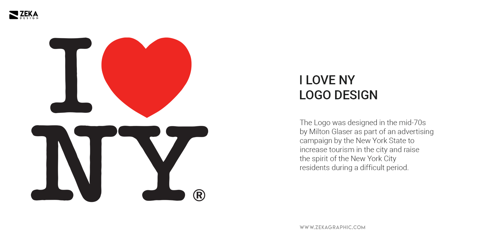
I showed you some of Milton Glaser most important graphic design works, but now let’s talk about the most famous logo design designed by Glaser, I Love NY Logo. The Logo was designed in the mid-70s as part of an advertising campaign by the New York State to increase tourism in the city and raise the spirit of the New York City residents during a difficult period where the state was close to bankruptcy and the city registered high rates of crime.
The marketing campaign was led by advertising agency Wells Rich Green who centred the campaign on the slogan nowadays everybody knows “I Love New York” but they were in need for a logo to visually represent this idea and hired the already well-known graphic designer based in New York Milton Glaser to design it.
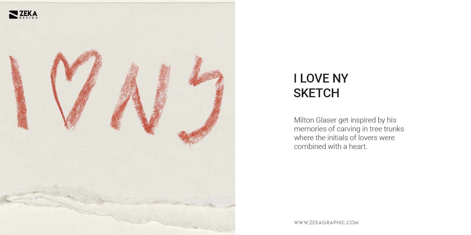
A funny fact about this story is that the actual version of the logo for “I Love New York” was the second version. Glaser spent one week working on the first design and he produced a typographic design solution and submitted to Wells Rich Green, and this version was approved, but a week later he called Doyle to say that he has a better idea and after initial refuse of Doyle to present the new concept, he finally agrees and the second version was approved by everyone and this second version is the iconic I Love NY logo we all know.
The second version of I Love NY logo was designed only in 10 seconds and Milton Glaser get inspired by his memories of carving in tree trunks where the initials of lovers were combined with a heart, he materialises this concept on the image we see nowadays. He used a variation of American Typewriter font for the letters we see in the logo due to its informality and literally reference in the name.
Advertisment
Since the release of this Logo in the mid 70’s it has been used till our days to express love for the city of New York by the residents and tourists who visit the city every year, and we can say that it’s a clear example of a good logo design as it fulfils all the 7 qualities for a great logo design which you can discover in this post, and this helps it to create a memorable and iconic symbol for the city of New York. And if you are looking for more logo design inspiration I recommend you these posts.
If you found this post useful you might like to read these post about Graphic Design History and Logo Design.
Advertisment
Written by
If you like this post share it on your social media!
Advertisment
Advertisment