Balance is key to creating visually appealing and organized designs as it’s one of the fundamental principles that ensures your work feels cohesive and professional. By distributing elements evenly across a design, you create harmony and prevent your composition from feeling chaotic or unpolished. Without balance, designs can overwhelm or confuse the viewer, leading to a negative user experience.
In this article you will dive into different types of balance—symmetrical, asymmetrical, radial, and mosaic—and how each can influence the feel of a design. Mastering these concepts will elevate your work, helping you create visually stable and captivating designs.
Ready to unlock the secrets of design balance? Keep reading!
Advertisment
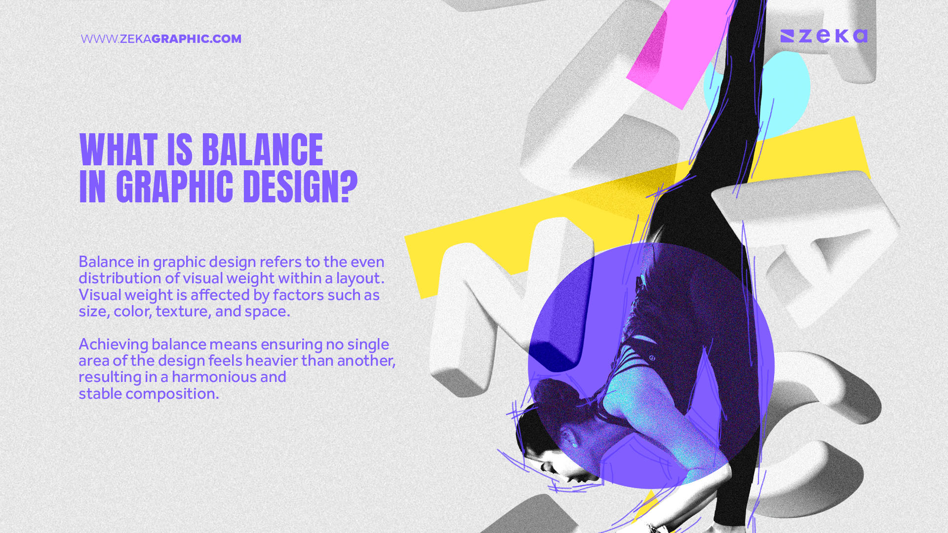
Balance in graphic design refers to the even distribution of visual weight within a layout. Visual weight is affected by factors such as size, color, texture, and space. Achieving balance means ensuring no single area of the design feels heavier than another, resulting in a harmonious and stable composition. This concept is fundamental because a well-balanced design directs the viewer’s attention seamlessly, guiding them through the content in an intuitive way.
Balance can be understood through symmetry, where elements are mirrored or evenly distributed, and asymmetry, where contrasting elements balance each other in visual weight. Whether a design is formal or dynamic, understanding and applying balance allows designers to create appealing and functional layouts that resonate with audiences.
Advertisment
Applying balance can take many forms, from symmetrical arrangements that exude harmony to asymmetrical layouts that add dynamic tension. By mastering balance, you’ll improve not only the aesthetics of your design but also the communication of your message, so let’s see the different types of Balance and how to apply them correctly.
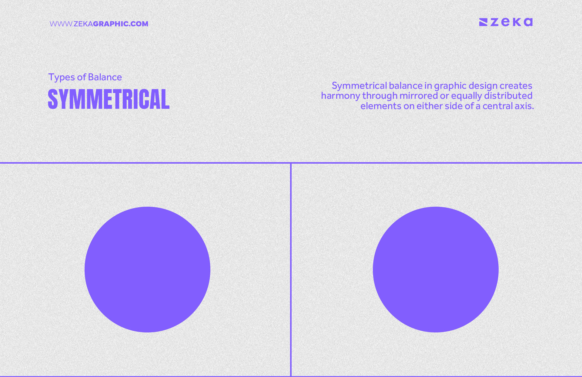
Symmetrical balance in graphic design creates harmony through mirrored or equally distributed elements on either side of a central axis. It is often used in formal, structured layouts such as logos, book covers, or traditional print designs as symmetrical designs evoke a sense of calm, stability, and professionalism, making them suitable for corporate branding, institutional designs, or classical-themed compositions.
Designers can use symmetry to create a clean, organized look that appeals to users who prefer order and simplicity. However, over-reliance on symmetry can sometimes result in a predictable or rigid design, which may not suit more dynamic or modern contexts.
Advertisment
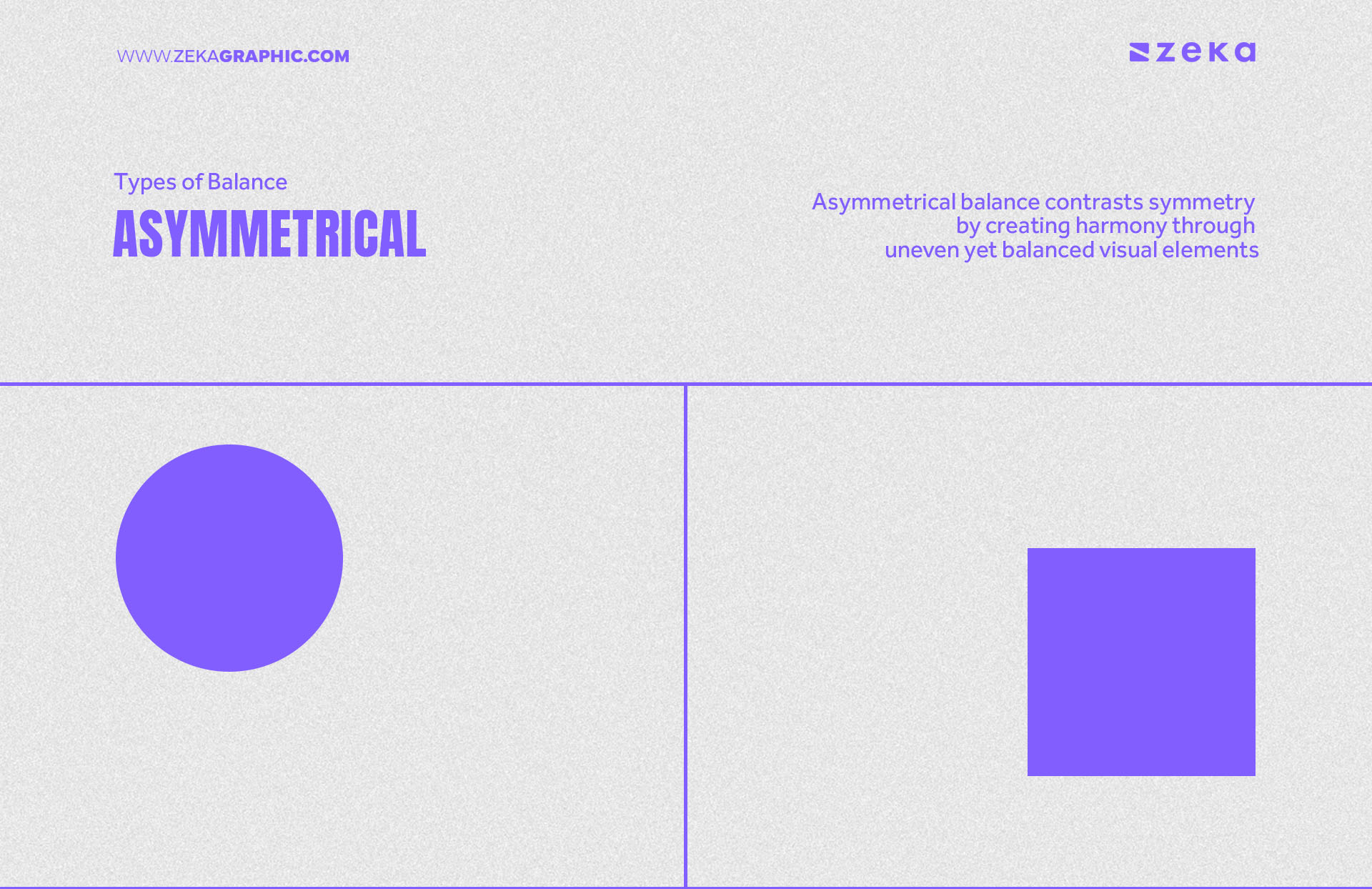
Asymmetrical balance contrasts symmetry by creating harmony through uneven yet balanced visual elements. It is more dynamic and allows for creativity by balancing objects that differ in size, shape, color, or texture. Unlike symmetrical balance, asymmetrical designs bring energy and movement to a layout, often making the design feel more natural and engaging.
This type of balance is commonly used in modern, edgy, or minimalist designs as it allows designers to create unique compositions where visual weight is distributed more freely, giving a sense of intentional imbalance that still feels cohesive. Asymmetry encourages creativity and visual interest, making it a popular choice for contemporary branding, website layouts, and posters.
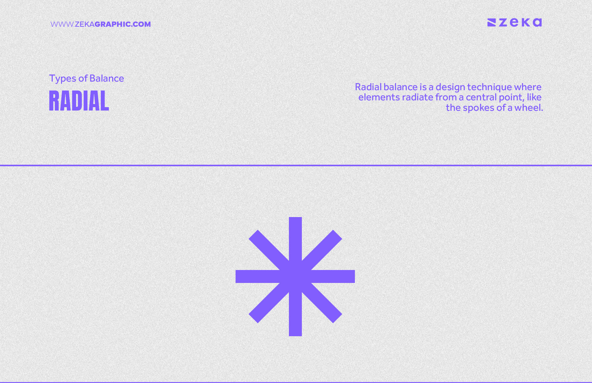
Radial balance is a design technique where elements radiate from a central point, like the spokes of a wheel. This type of balance creates a strong focal point and a sense of movement, making it ideal for designs that need to draw the viewer’s eye toward the center. It is frequently used in branding, where logos or icons require immediate attention.
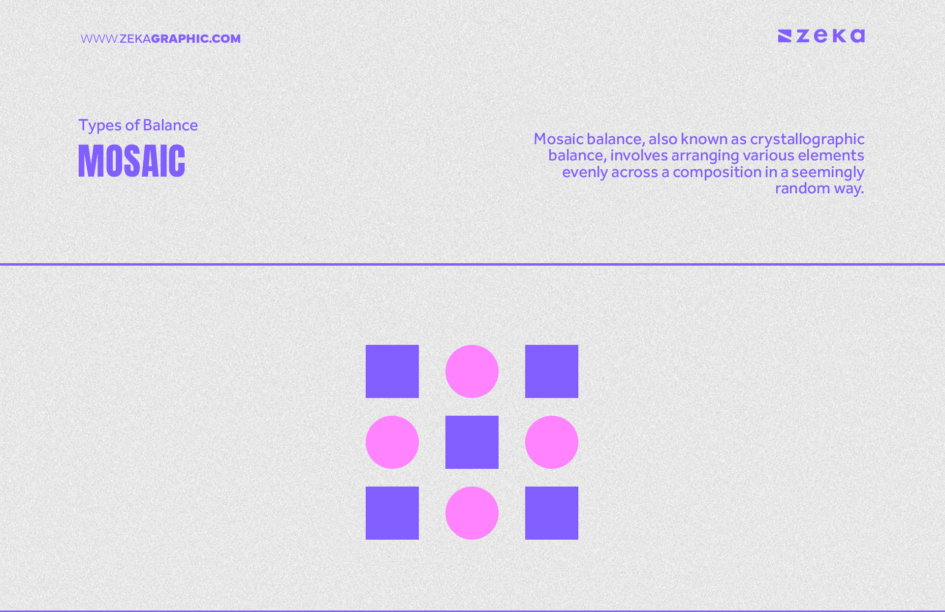
Mosaic balance, also known as crystallographic balance, involves arranging various elements evenly across a composition in a seemingly random way. Despite the apparent disorder, mosaic balance achieves visual harmony by distributing elements consistently across the layout. It’s particularly effective in textured or pattern-based designs, often seen in artistic compositions or background designs that aim to create richness without a central focal point.
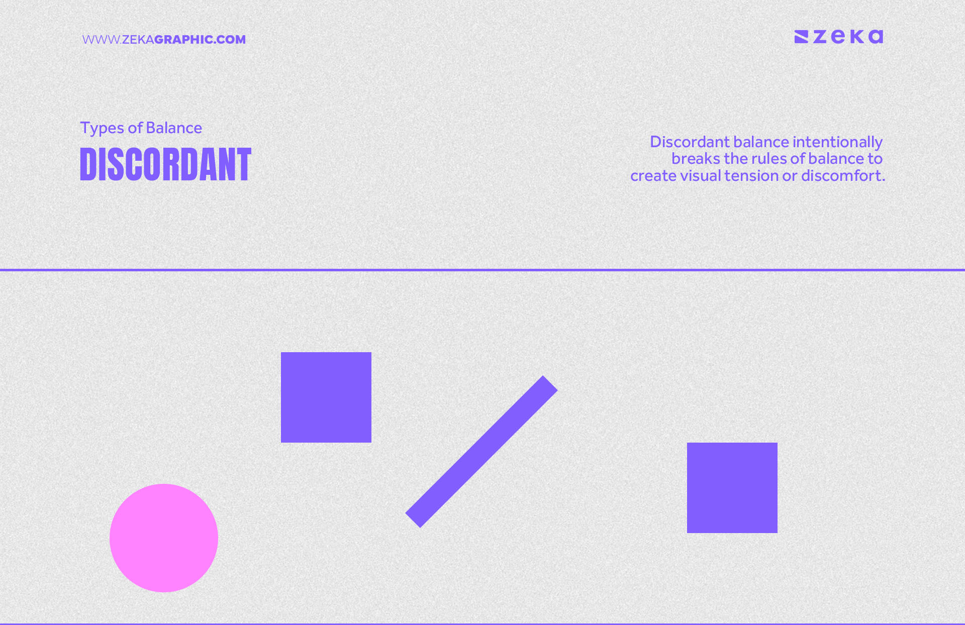
Discordant balance intentionally breaks the rules of balance to create visual tension or discomfort. While it’s a risky approach, discordant balance can be used to make a bold statement, draw attention, or evoke strong emotions. It works well in edgy or experimental designs as it can overwhelm your audience if overused, but in the right context, it can make your design unforgettable.
Now, that we already know the different types of Balance, there are different ways to achive it, let’s take a look on them.
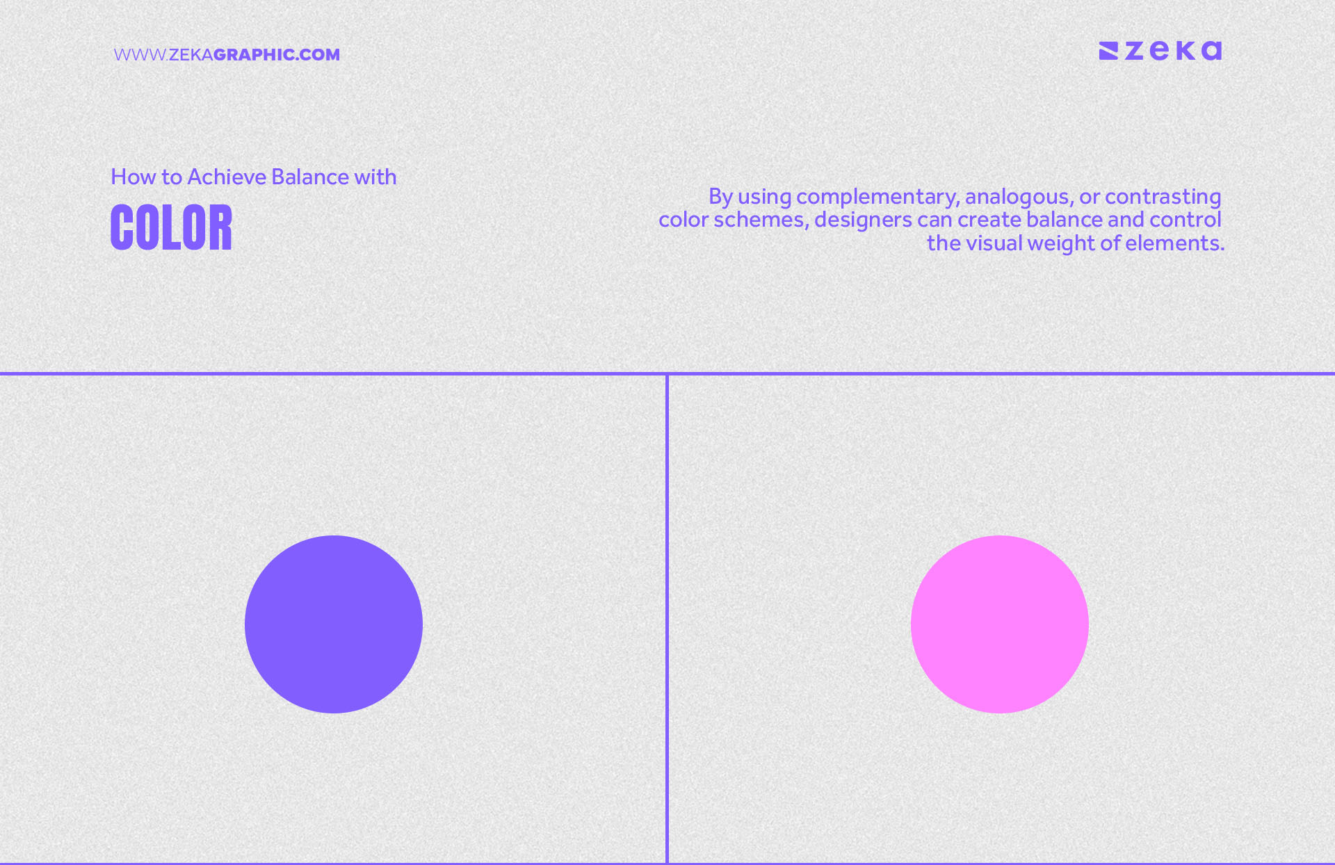
By using complementary, analogous, or contrasting color schemes, designers can create balance and control the visual weight of elements. For example, complementary colors can add dynamic tension, while analogous colors foster unity. Through the strategic use of color, you can guide viewers’ attention and establish a focal point, ultimately creating a cohesive and balanced design that feels aesthetically pleasing.
Advertisment
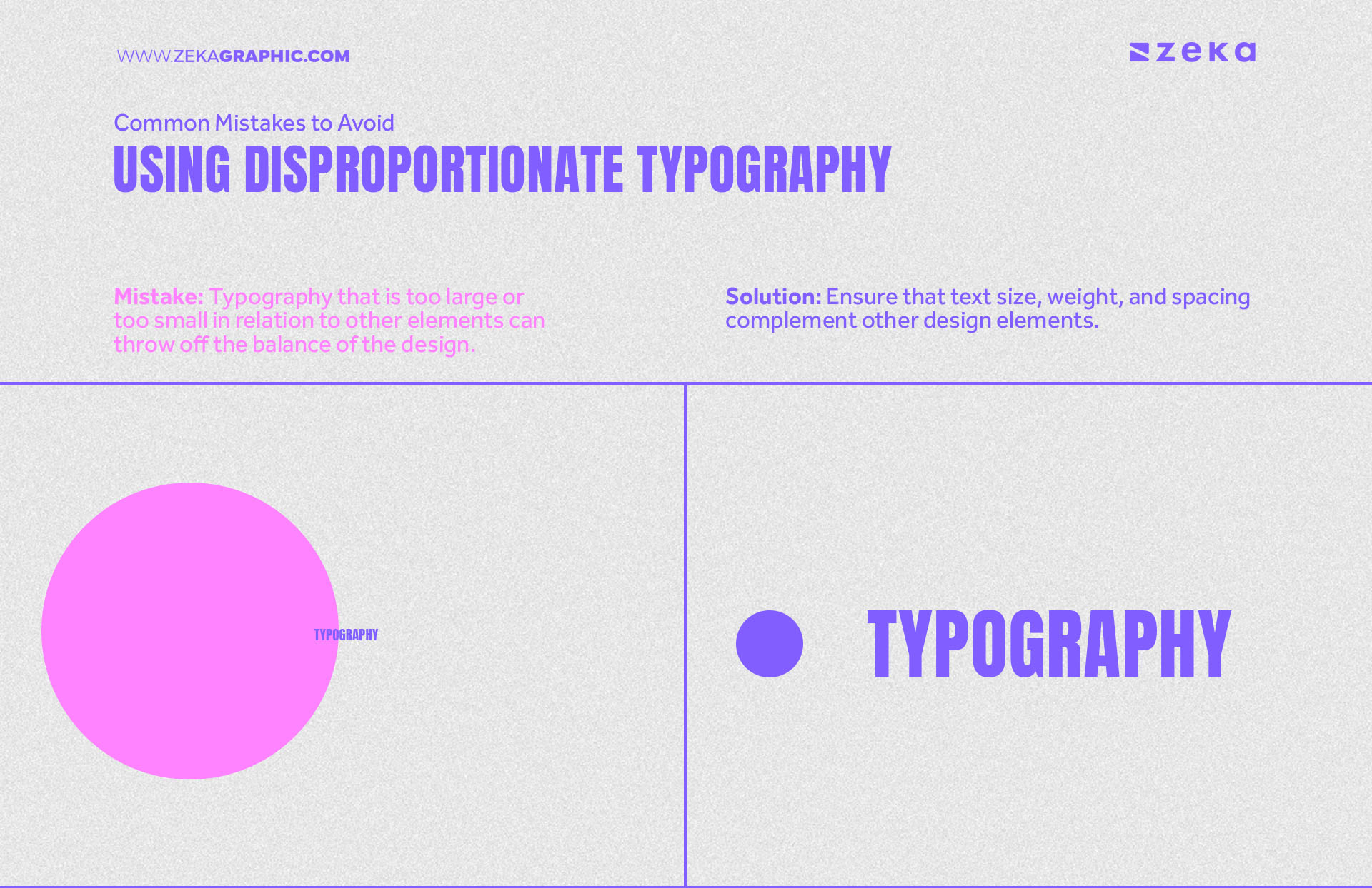
Typography balance in graphic design involves using font weight, size, and spacing to complement other elements in a layout. Fonts should be chosen thoughtfully to ensure they don’t overpower the overall design. Bold and heavier fonts can be used for titles or important information, while lighter fonts can balance out the visual hierarchy. Proper letter spacing and line height help maintain readability and ensure that typography enhances rather than detracts from the visual balance of the design.
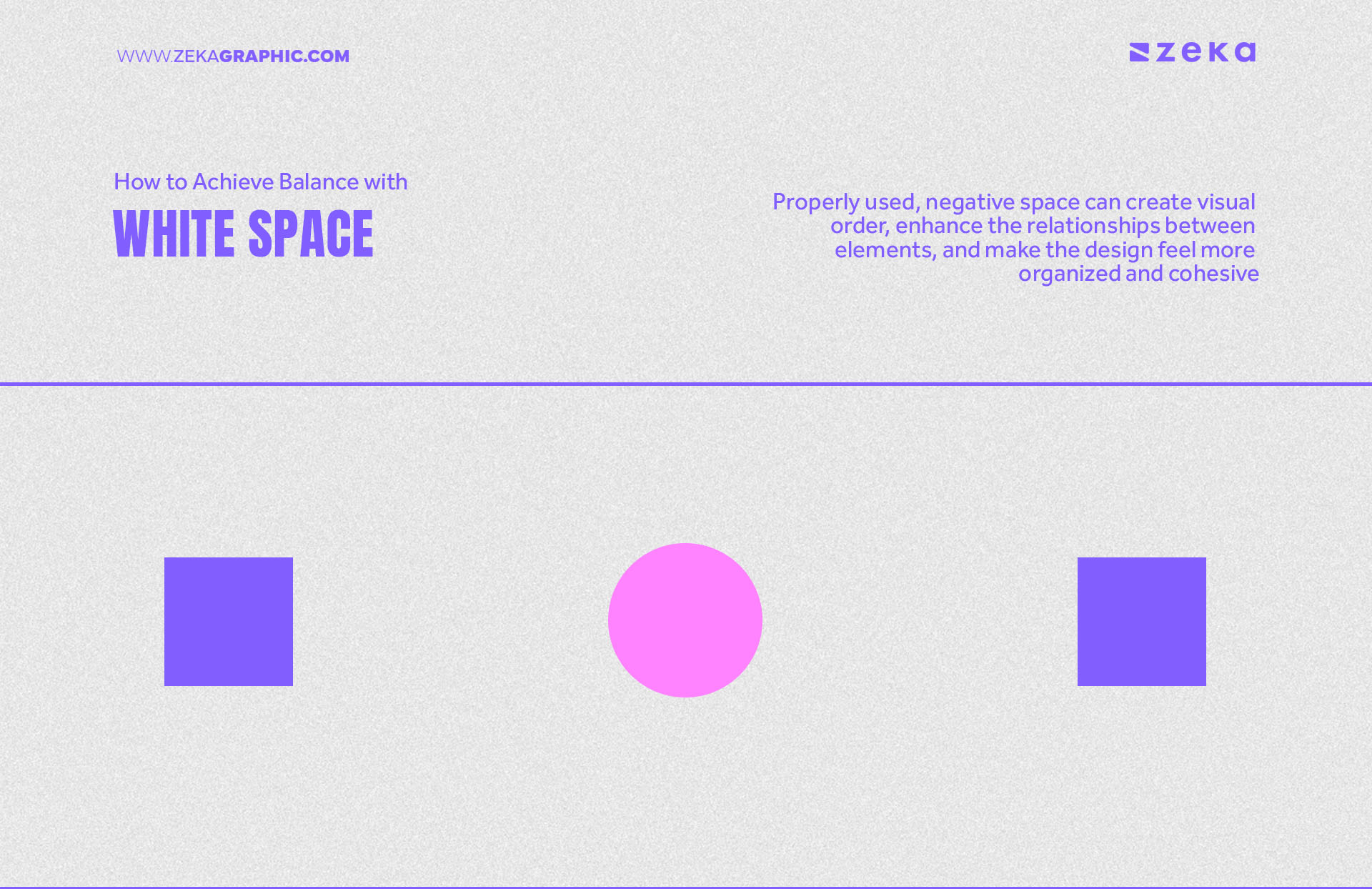
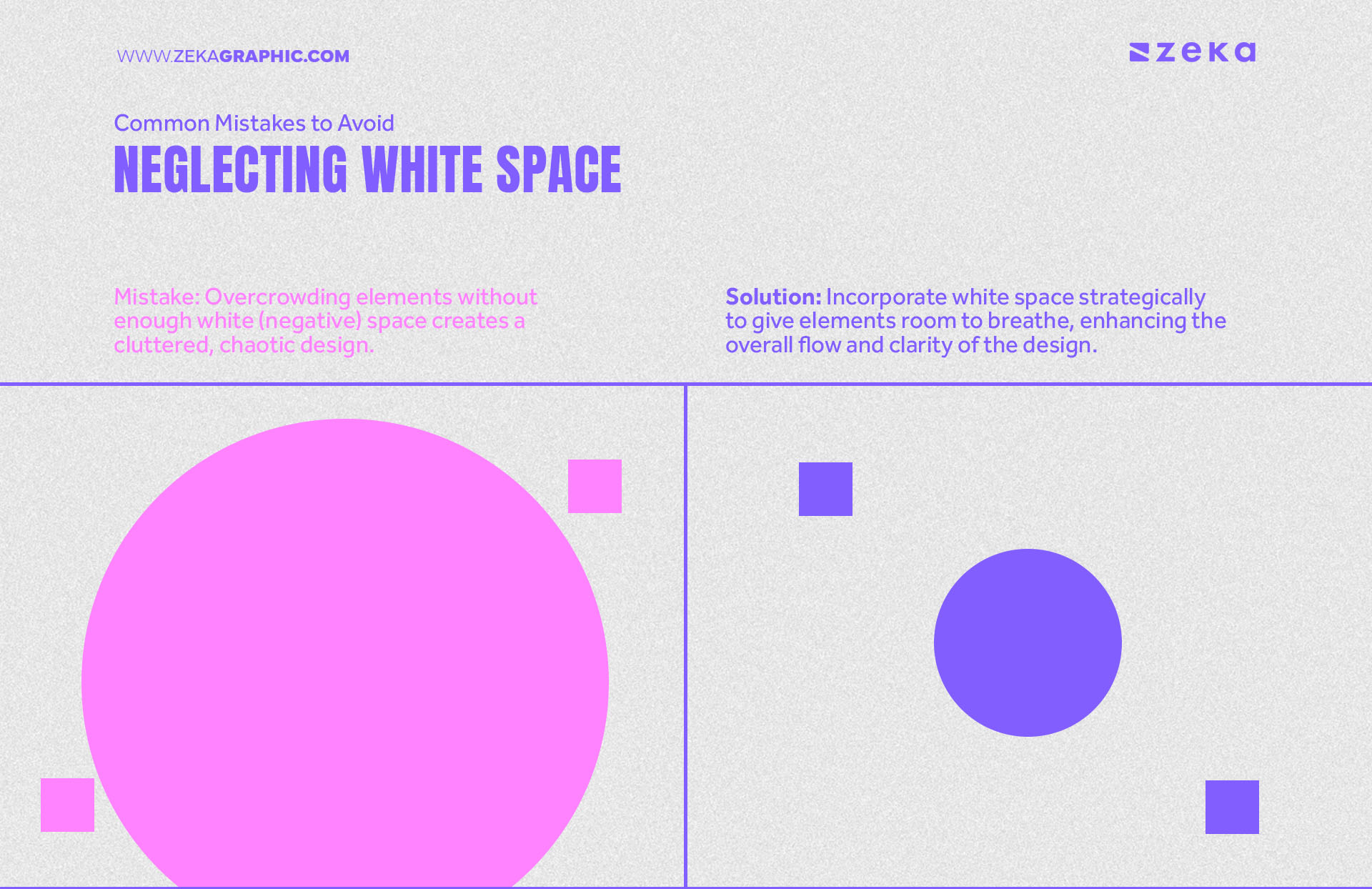
White space, or negative space, is a vital tool for achieving balance in graphic design by giving design elements room to breathe, white space prevents clutter and allows viewers to focus on the key aspects of the composition. Properly used, negative space can create visual order, enhance the relationships between elements, and make the design feel more organized and cohesive. It also contributes to a clean, minimalist aesthetic that emphasizes balance without overwhelming the viewer.
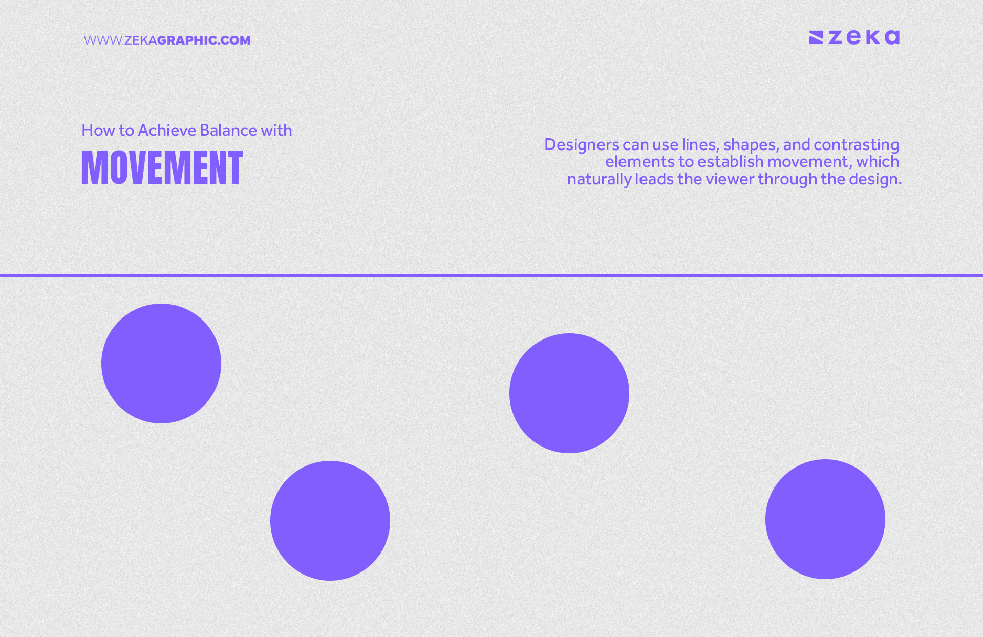
Movement in graphic design refers to the way visual elements guide the viewer’s eye through a composition, helping to create balance and flow. Designers can use lines, shapes, and contrasting elements to establish movement, which naturally leads the viewer through the design. A well-balanced layout uses movement to create a visual journey that feels both dynamic and harmonious.
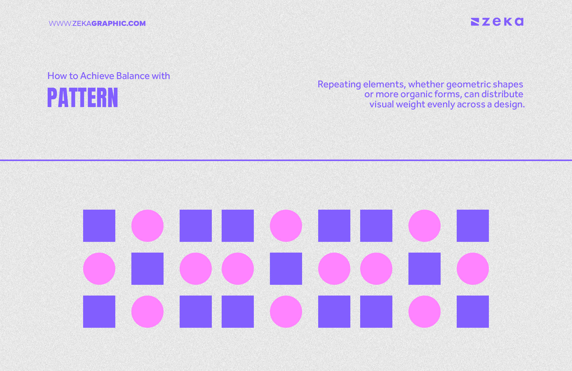
Patterns in graphic design can contribute to balance by adding texture and rhythm to a composition. Repeating elements, whether geometric shapes or more organic forms, can distribute visual weight evenly across a design. When used strategically, patterns can bring a sense of structure and balance, helping to tie together various elements within a layout and create a cohesive design.
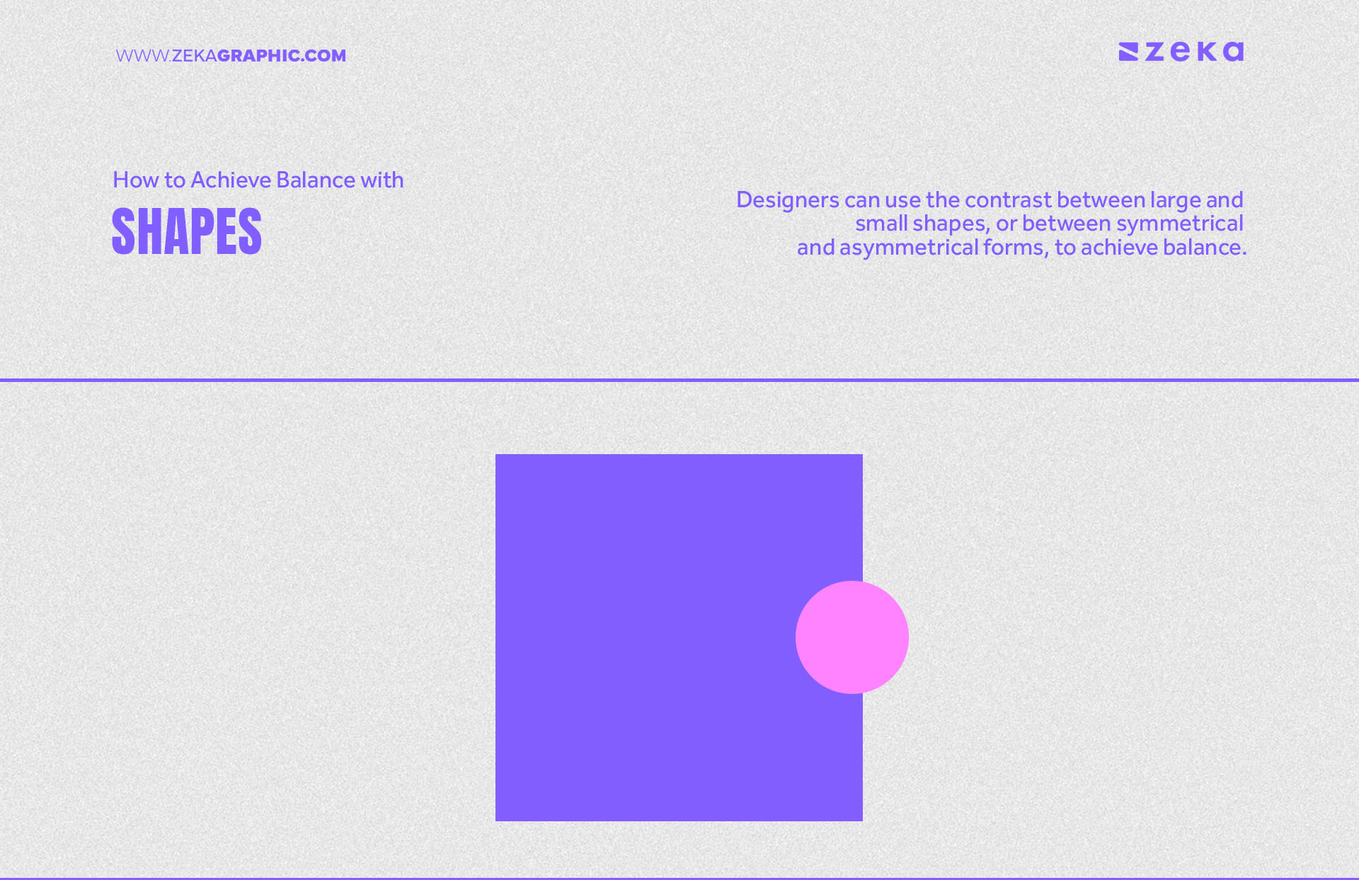
Whether geometric or abstract, shapes carry visual weight that influences the overall composition and Designers can use the contrast between large and small shapes, or between symmetrical and asymmetrical forms, to achieve balance. By carefully arranging shapes, a designer can guide the viewer’s eye and establish harmony, making the design more structured and visually appealing.
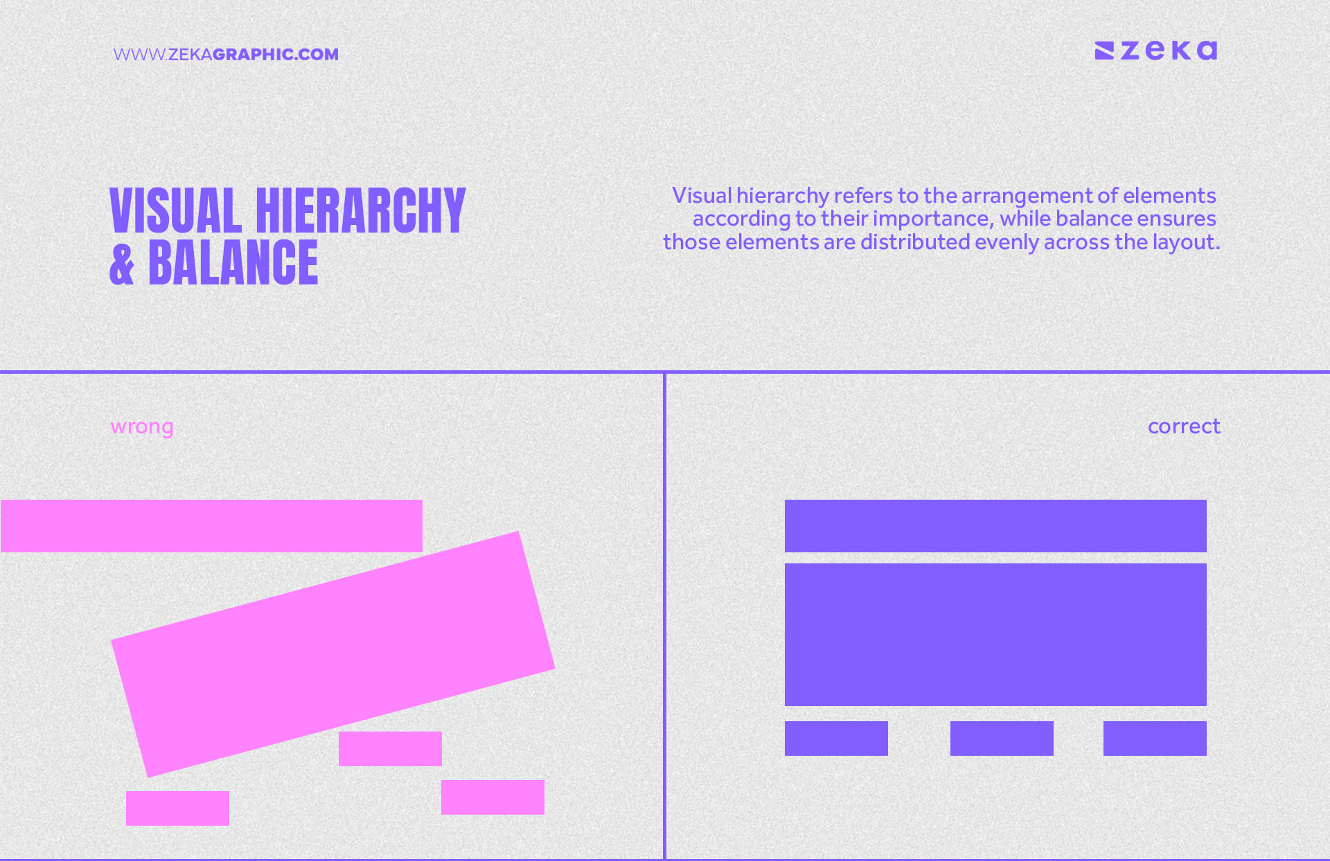
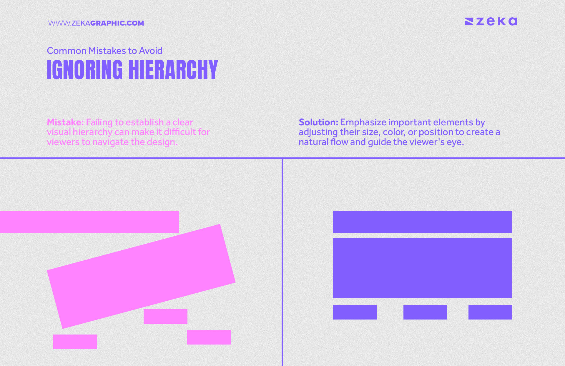
Visual hierarchy and balance work hand in hand in graphic design as visual hierarchy refers to the arrangement of elements according to their importance, while balance ensures those elements are distributed evenly across the layout. A clear hierarchy allows designers to direct the viewer’s eye in a specific order, while balance ensures that no area of the design overwhelms another.
By combining these two principles, designers can create layouts that flow naturally and guide the viewer through the content effortlessly. This not only enhances the user experience but also improves the overall aesthetic and functionality of the design.
Advertisment
Balance is essential for effective design because it creates visual harmony and structure, making compositions more appealing and easier to understand and without balance, designs can feel chaotic and unorganized, leading to confusion or distraction for the viewer.
By distributing visual weight properly through symmetry, asymmetry, or radial balance, designers can guide the viewer’s attention, establish focal points, and ensure that no element overpowers another that enhances user engagement, delivering a cohesive and aesthetically pleasing experience.
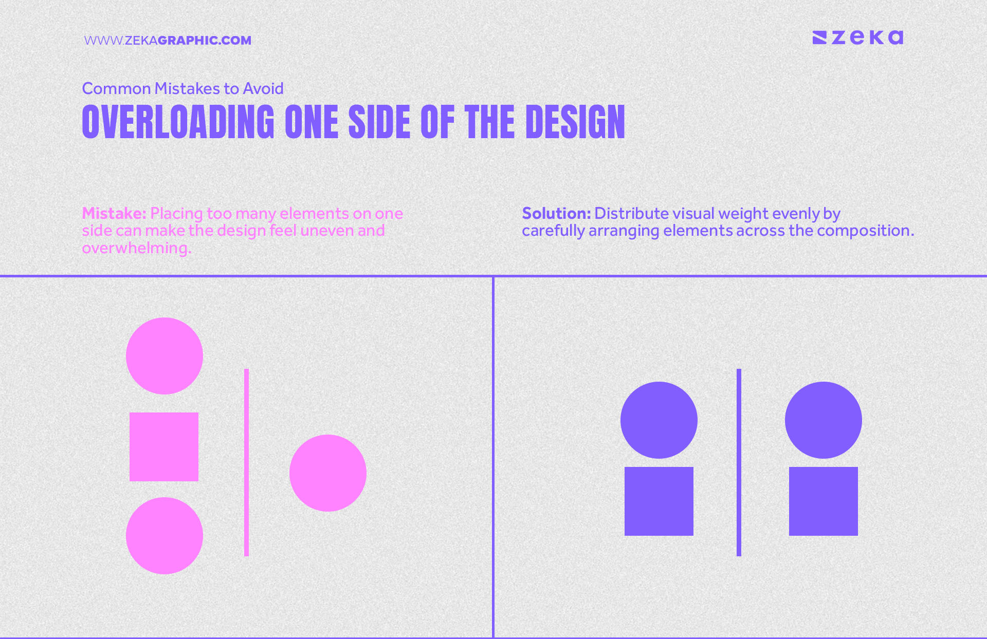
Here are common mistakes designers often make when trying to achieve balance in their work, along with tips for avoiding them:
Advertisment
Advertisment
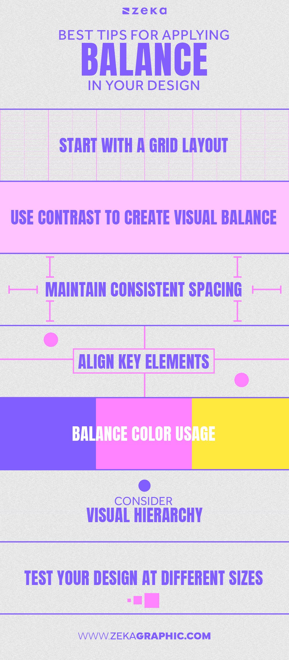
Now that we already know what Balance is and the different types, here are some useful design tips that will help you apply balance in your next projects.
Sometimes, rules are meant to be broken, and with Balance is not an exception. Experimenting with balance in graphic design allows you to push creative boundaries and make your designs stand out, helping you craft compelling and unique compositions while keeping a sense of harmony and cohesion.. Here are a few techniques to explore:
Advertisment
Whether through symmetrical, asymmetrical, radial, or mosaic balance, understanding how to distribute visual weight ensures that designs feel harmonious and stable. Mastering the principles of balance allows designers to create layouts that captivate the viewer’s attention while maintaining a sense of order.
By experimenting with various types of balance and applying them thoughtfully, you can push the boundaries of creativity. Ultimately, mastering balance is key to producing designs that resonate with audiences and leave a lasting impression.
If you found this post useful you might like to read these post about Graphic Design Inspiration.
Advertisment
Written by
If you like this post share it on your social media!
Advertisment
Advertisment