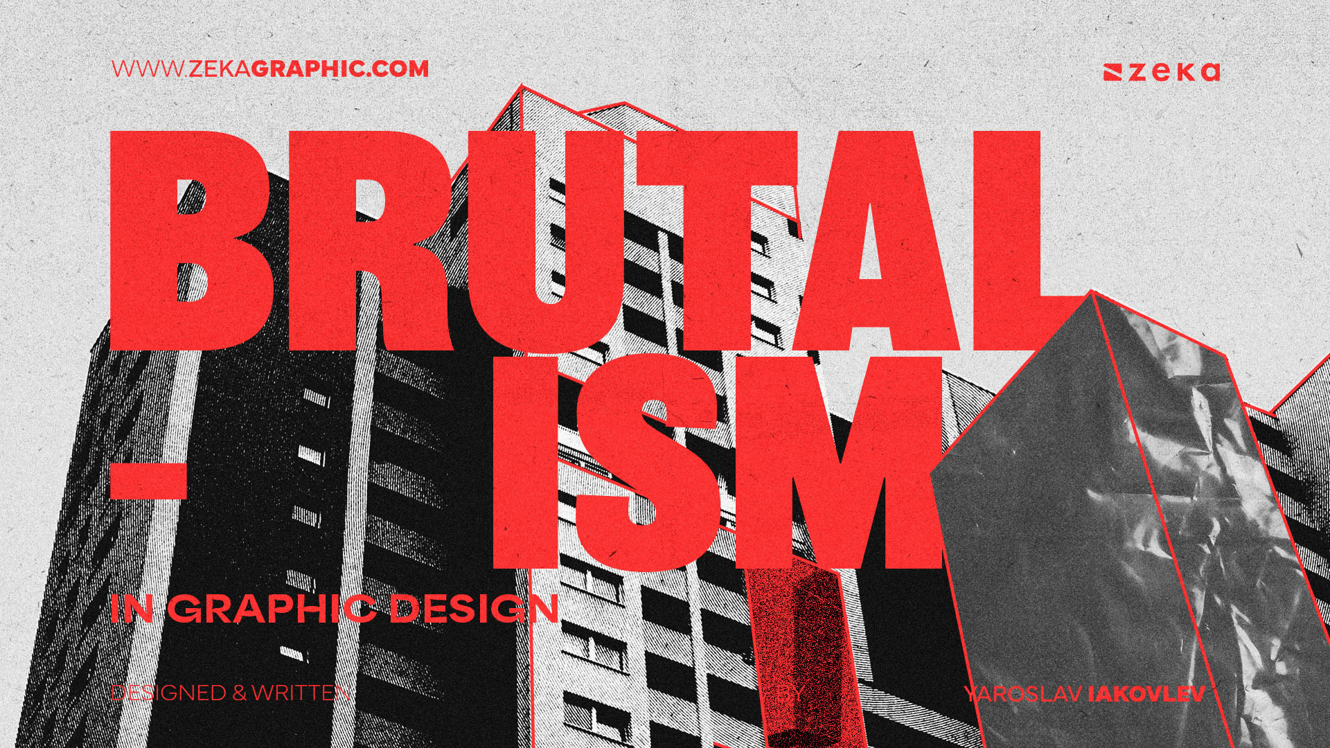
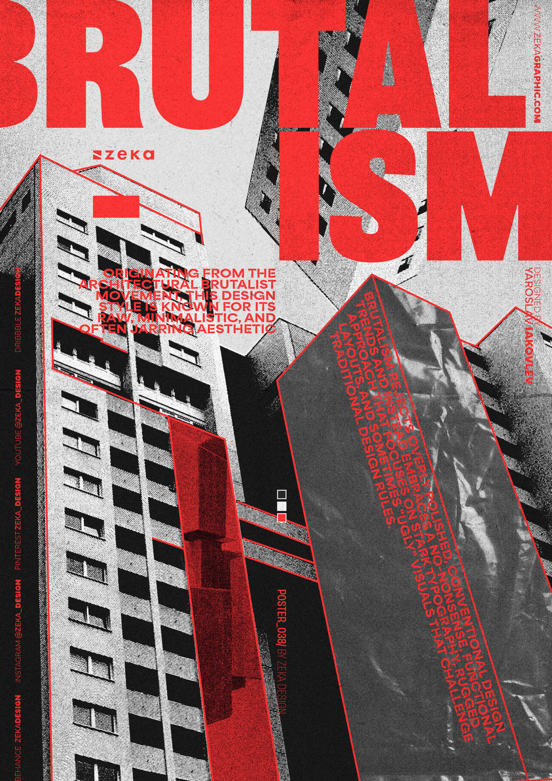
Brutalism in graphic design is a fascinating and unconventional style that has become more popular in recent years. Originating from the architectural Brutalist movement, this design style is known for its raw, minimalistic, and often jarring aesthetic.
Brutalism rejects overly polished, conventional design trends and instead embraces a no-nonsense, functional approach that focuses on stark typography, rugged layouts, and sometimes “ugly” visuals that challenge traditional design rules.
This design style has resonated with a number of rebellious brands and digital designers looking to break away from cookie-cutter designs and create something with impact as a refreshing alternative that prioritizes authenticity over visual harmony. If you are curious about this design style, let’s take a more in-depth look.
Advertisment
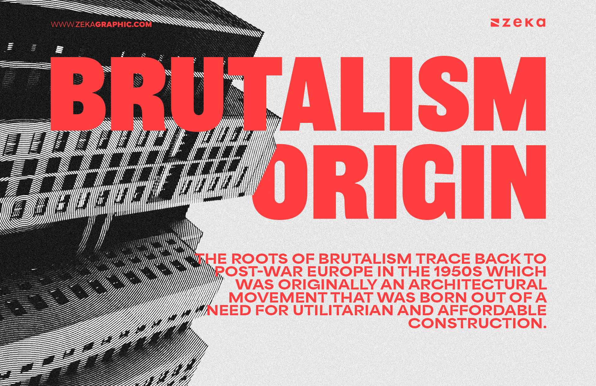
To understand the importance of Brutalism in Graphic Design, first, we need to know the roots of Brutalism which trace back to post-war Europe in the 1950s which was originally an architectural movement that was born out of a need for utilitarian and affordable construction.
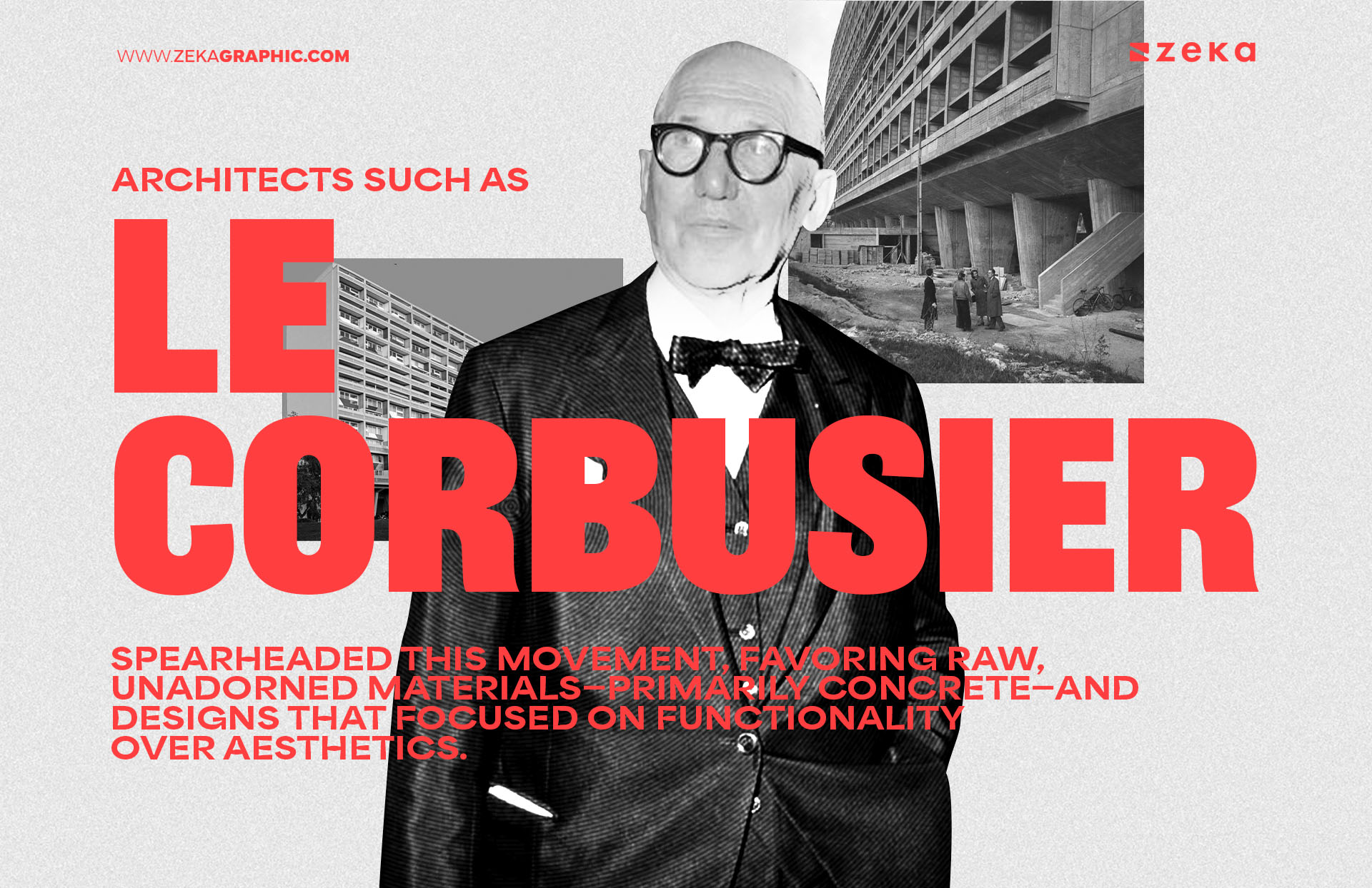
This was especially prominent in war-torn areas where resources were scarce, and rebuilding cities quickly and efficiently was the primary goal. Architects such as Le Corbusier and Alison & Peter Smithson spearheaded this movement, favoring raw, unadorned materials—primarily concrete—and designs that focused on functionality over aesthetics.
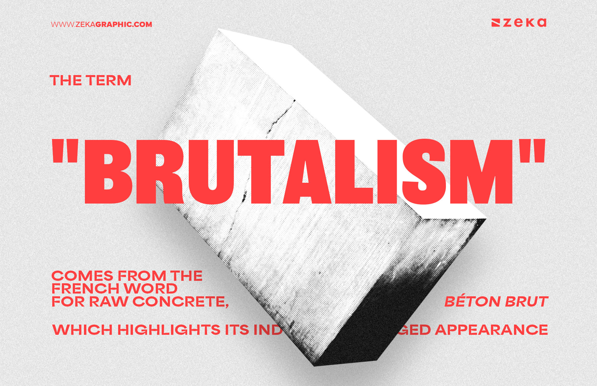
The term “Brutalism” itself comes from the French word for raw concrete, béton brut, which highlights its industrial, rugged appearance.
Fast forward to the early 2010s, and graphic designers began to reinterpret Brutalism in a digital context. Tired of the overly polished, minimalist web and app designs dominating the industry, designers started incorporating Brutalist principles in their work. This movement acted as a counterpoint to the clean, corporate style that had taken over, providing an anti-aesthetic approach that embraced imperfection and rawness. Brutalism’s “in-your-face” visuals were meant to jar and disrupt the user experience, prioritizing the message and functionality over seamless visual harmony. Plus, if you’re experimenting with this aesthetic, consider using an AI logo maker to create raw, identity-driven visuals that match the brutalist vibe.
Graphic designers such as Craig Oldham and studios like B.A.M. pushed this anti-aesthetic forward by using asymmetrical grids, harsh color contrasts, and unrefined elements. These visual cues drew direct inspiration from the architectural Brutalist movement—both challenging design norms and rebelling against digital design’s sleekness.
Brutalism’s popularity continued to rise, especially within independent projects, avant-garde branding, and edgy startup companies as designers looked for new ways to capture attention and connect emotionally with users, the anti-design elements of Brutalism—exaggerated typography, rough edges, and visible grids—became a statement of defiance against the polished perfectionism seen in mainstream digital spaces.
For designers looking to bring bold concepts like Brutalism to life in their presentations or client pitches, Decksy offers a practical solution. This platform provides creative, professionally designed presentation templates that allow you to showcase unconventional aesthetics while maintaining clarity and impact. Whether you’re presenting a brand concept inspired by Brutalist design or pitching a campaign that challenges visual norms, using tools like Decksy helps you balance artistic freedom with structure—ensuring your ideas make a strong, memorable impression.
Advertisment
Brutalism in graphic design is defined by its embrace of raw, unpolished, and often intentionally “ugly” visuals. While it may seem chaotic, the style is rooted in a deliberate rejection of conventional design norms, making functionality and directness its top priorities. These key characteristics are often employed to create a visual language that challenges and engages viewers in unexpected ways, so let’s check some of them.
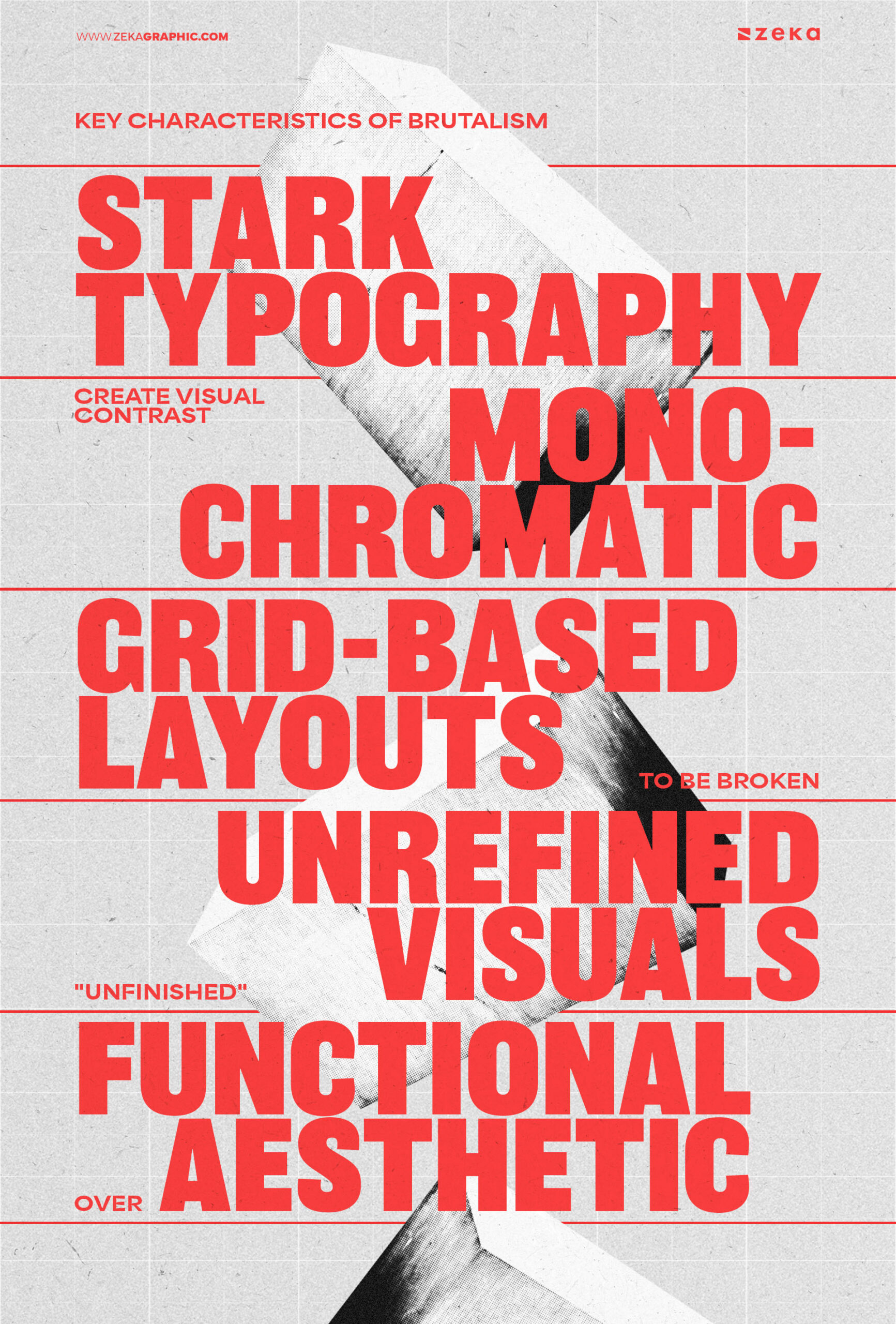
When incorporating Brutalist elements, balance the rawness with readability and usability to ensure the design remains effective without overwhelming the user.
Advertisment
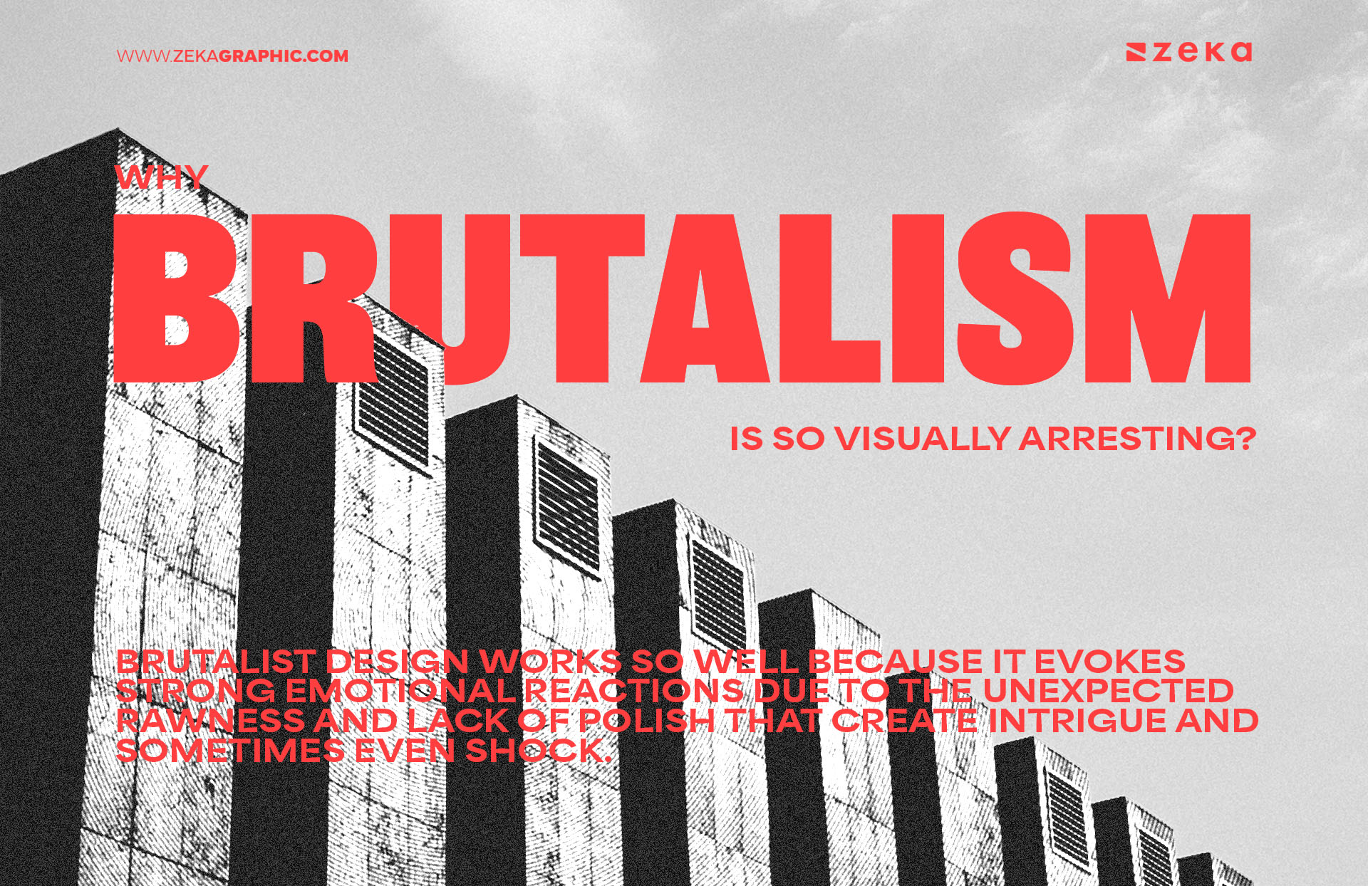
Brutalist design works so well because it evokes strong emotional reactions due to the unexpected rawness and lack of polish that create intrigue and sometimes even shock. This visceral reaction is key to why the style works—it grabs attention in a way that more traditional or minimalist designs might not as brutalism thrives on disrupting the viewer’s expectations and delivering an experience that’s both unconventional and thought-provoking.
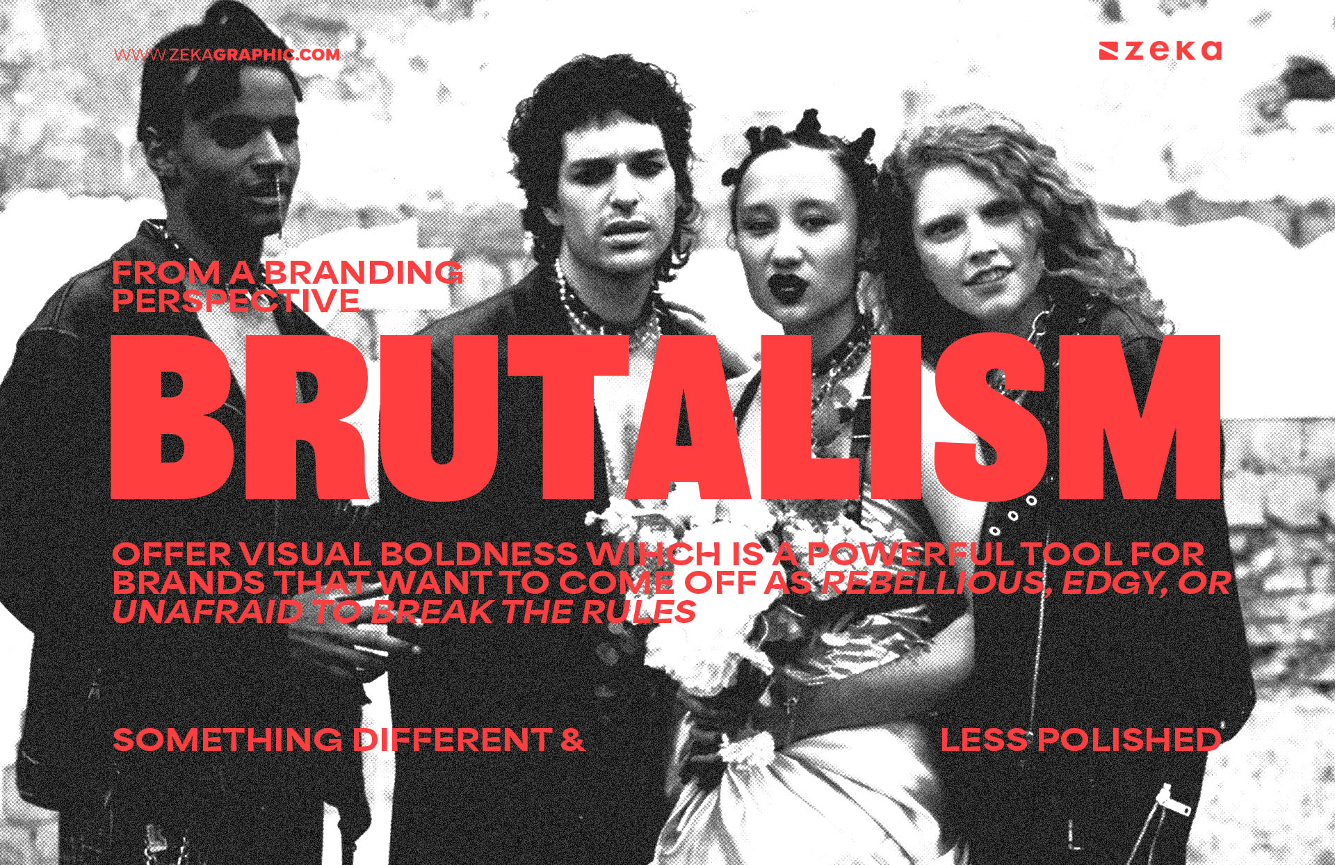
From a branding perspective, this visual boldness can be a powerful tool for brands that want to come off as rebellious, edgy, or unafraid to break the rules might choose a Brutalist aesthetic to align its visuals with its messaging.
The psychology behind this is simple: by presenting something different and less polished, Brutalist designs stand out and stick in the viewer’s memory. This makes it particularly effective for brands looking to make a bold statement.
Advertisment
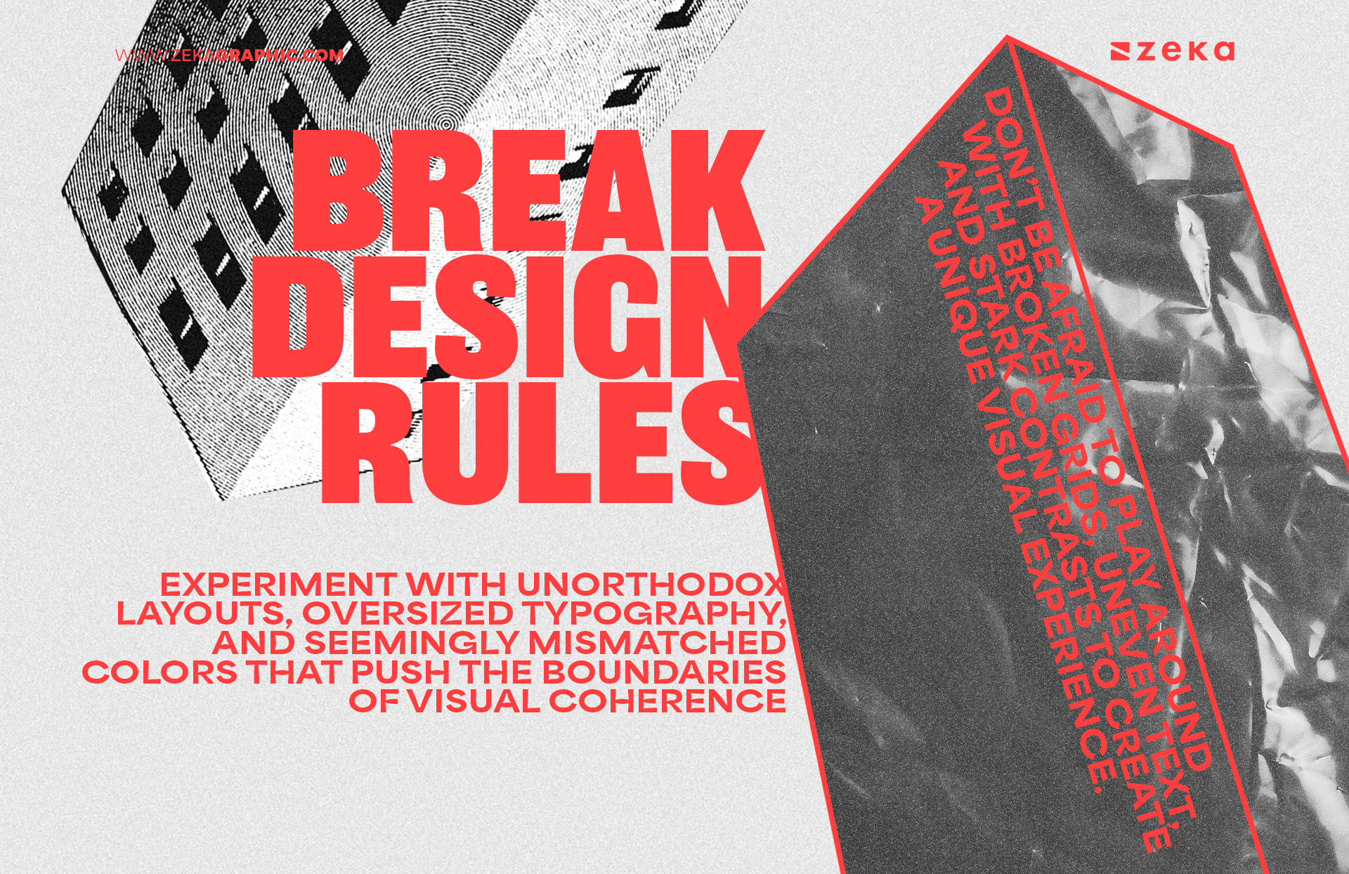
One of the hallmarks of Brutalism in graphic design is its ability to break conventional design rules with ease while most modern designs prioritize harmonious layouts, complementary color schemes, and clean typography, Brutalist designs throw these norms out the window to let designers have the freedom to experiment with unorthodox layouts, oversized typography, and seemingly mismatched colors that push the boundaries of visual coherence.
This approach can sometimes lead to the most creative results, and this is where Brutalism shines. It’s about abandoning the need for perfection and embracing the imperfections. If you’re working on a project where standing out is a priority, consider using Brutalist techniques—don’t be afraid to play around with broken grids, uneven text, and stark contrasts to create a unique visual experience.
Advertisment
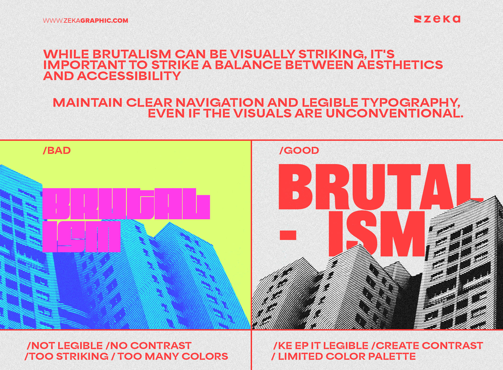
While Brutalism can be visually striking, it’s important to strike a balance between aesthetics and accessibility, especially in web and app design as brutalist websites, for instance, can sometimes become too overwhelming for users if accessibility features like readability, clear navigation, and proper contrast are ignored. A Brutalist design doesn’t have to compromise on functionality, so always consider user experience when working with this style.
A great way to make Brutalist designs more accessible is to maintain clear navigation and legible typography, even if the visuals are unconventional. You can still use bold, oversized text, but ensure it’s readable. Also, consider high-contrast color schemes that make important elements easy to spot and always test your design on different devices and with accessibility tools to ensure it works for everyone, not just those who love a bold visual statement.
Advertisment
Using Brutalism in graphic design projects requires a balance of bold experimentation and functional design.
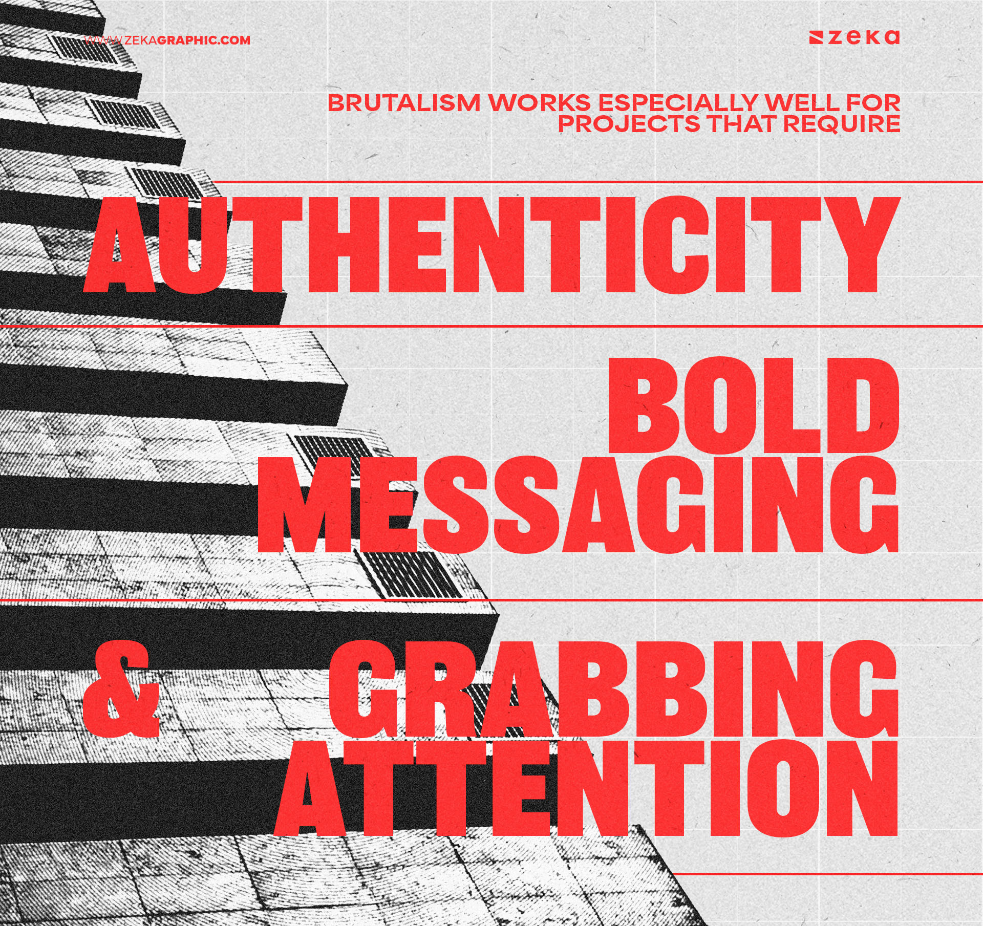
To start, consider the type of project you’re working on as Brutalism works especially well for projects that require authenticity, bold messaging, and grabbing the audience’s attention. For example, edgy startups, rebellious brands, or portfolios that want to showcase individuality are prime candidates for a Brutalist approach.
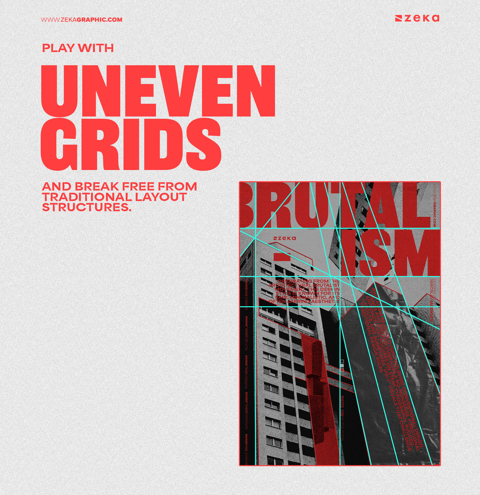
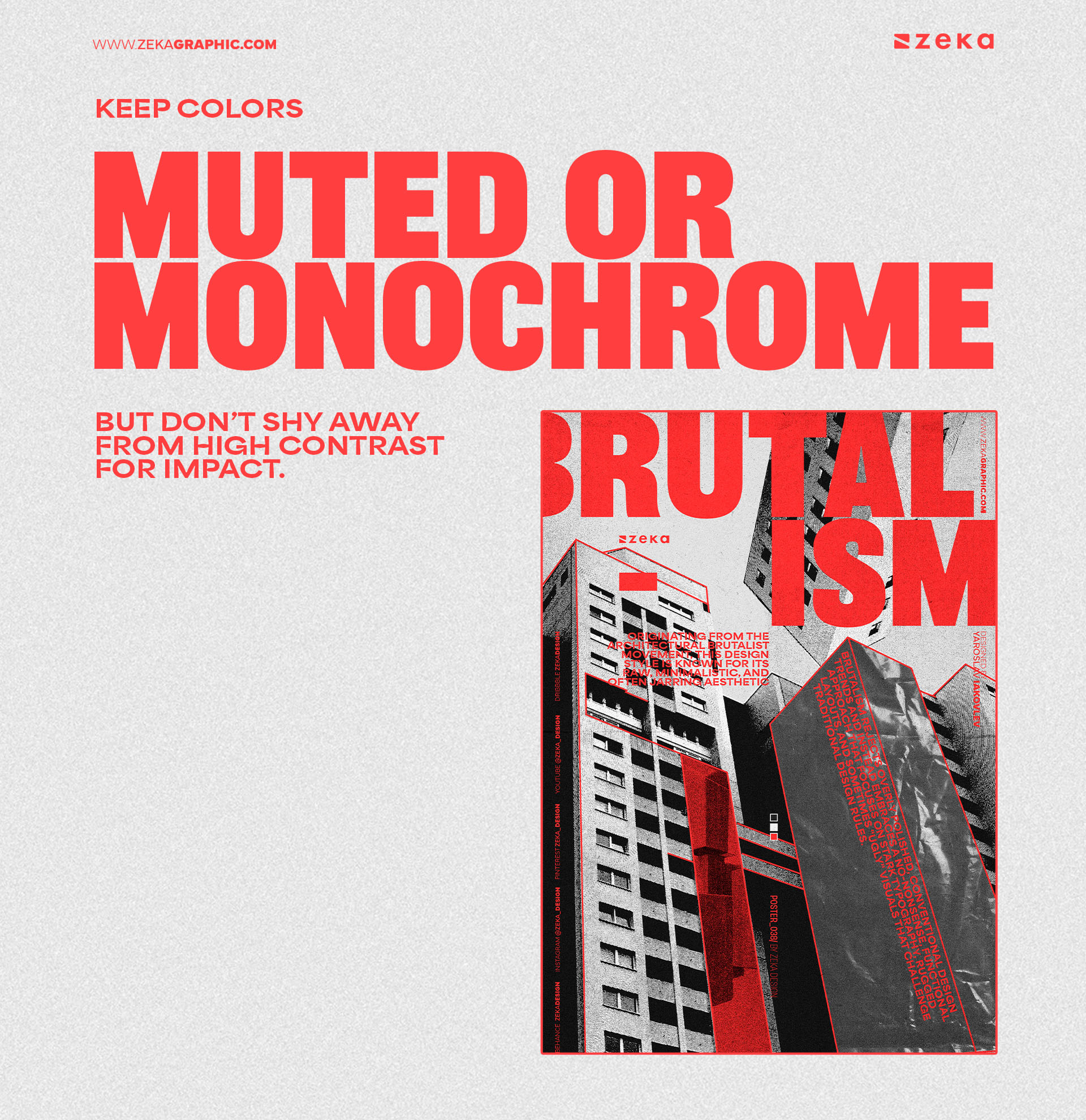
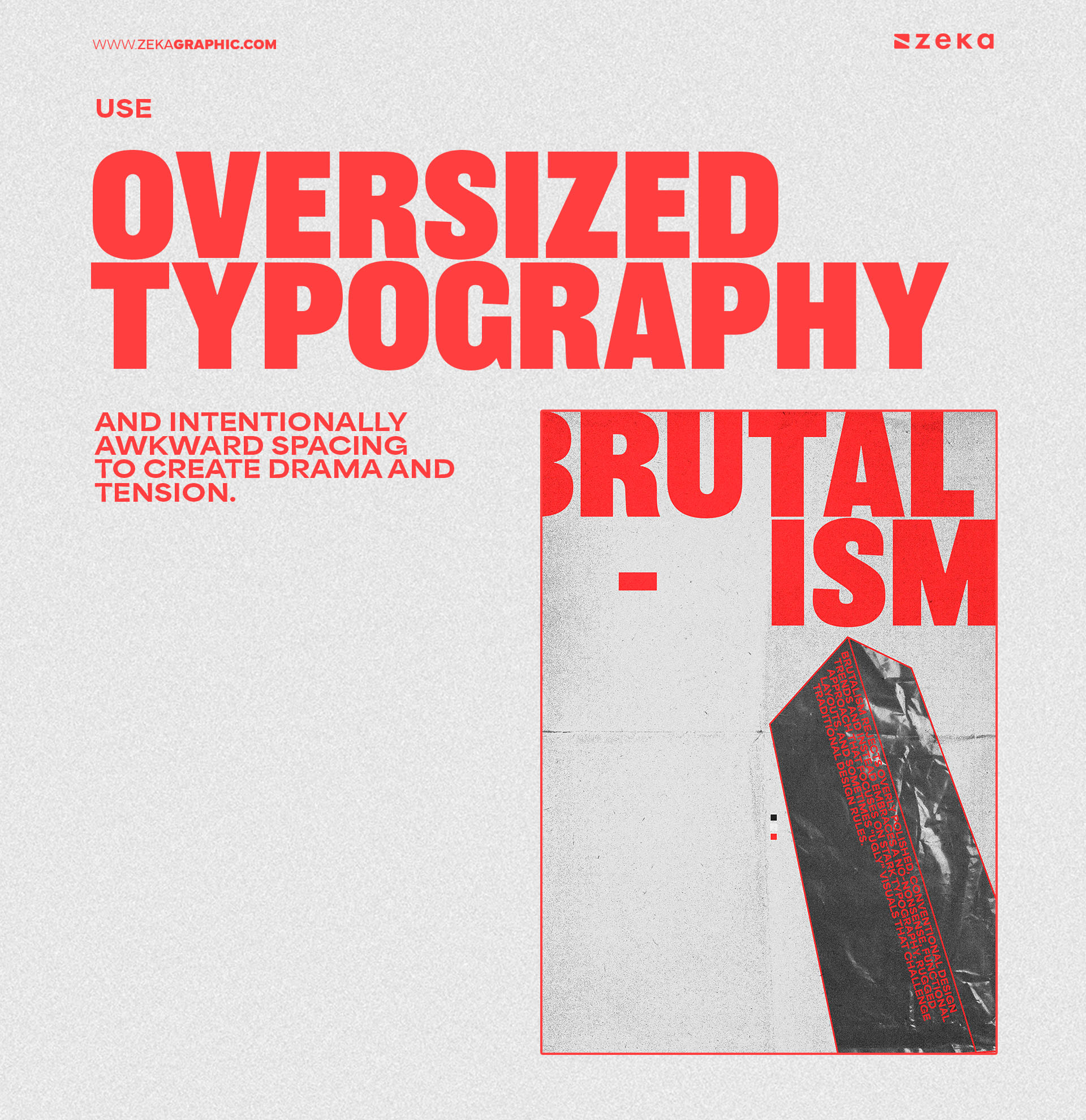
To apply Brutalism effectively, use unconventional font pairings, rough textures, and asymmetrical layouts. Experiment with layering elements that seem disconnected at first glance, but come together to create a raw, authentic visual narrative. Here are a few tips:
Advertisment
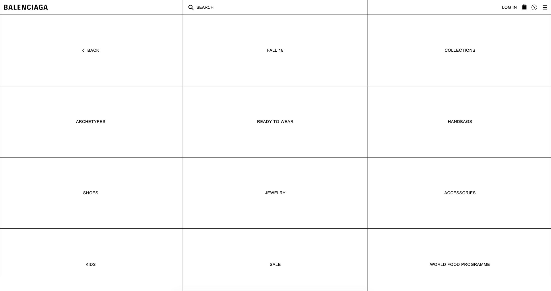
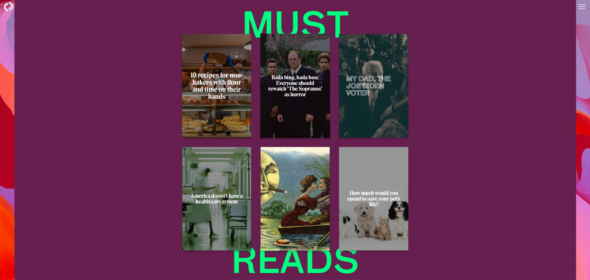
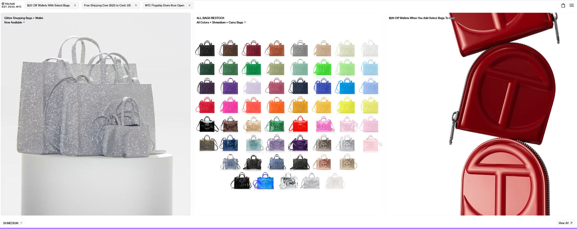
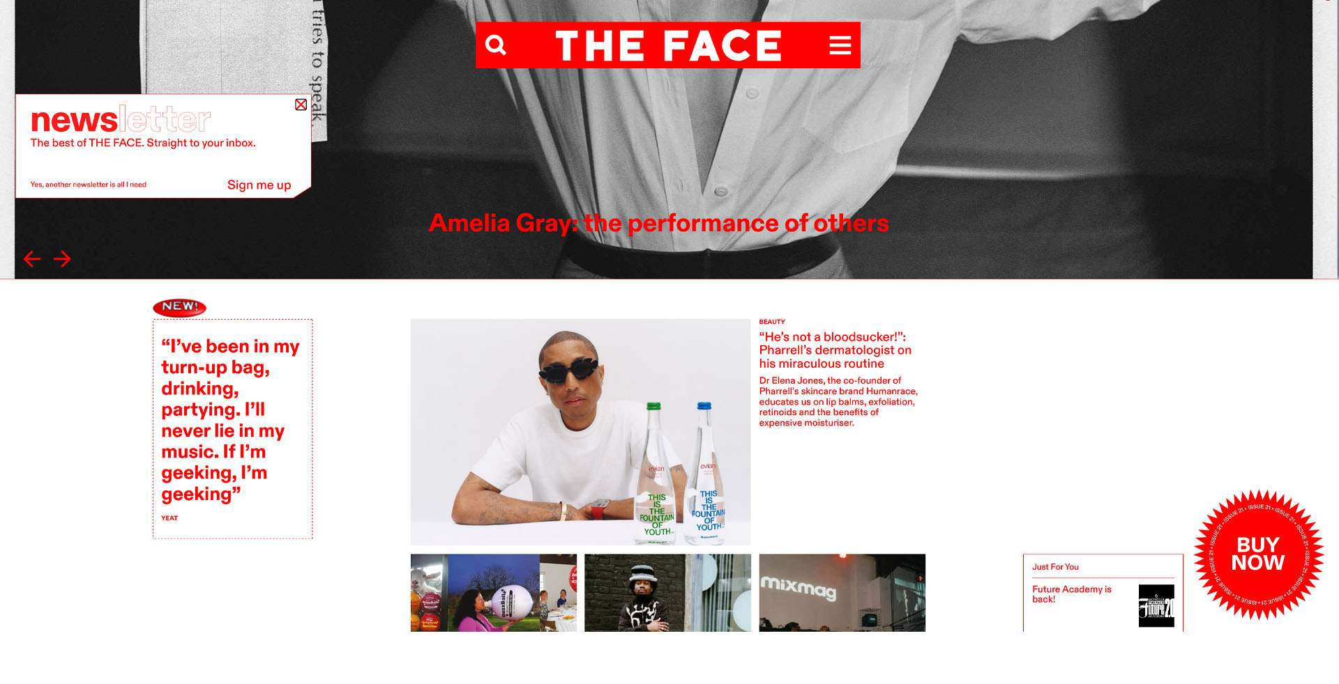
Brutalism’s raw, unpolished aesthetic has attracted brands looking to communicate authenticity, boldness, and a non-conformist identity. Let’s take a look on some of this brands and how they implemented this style into their branding.
Advertisment
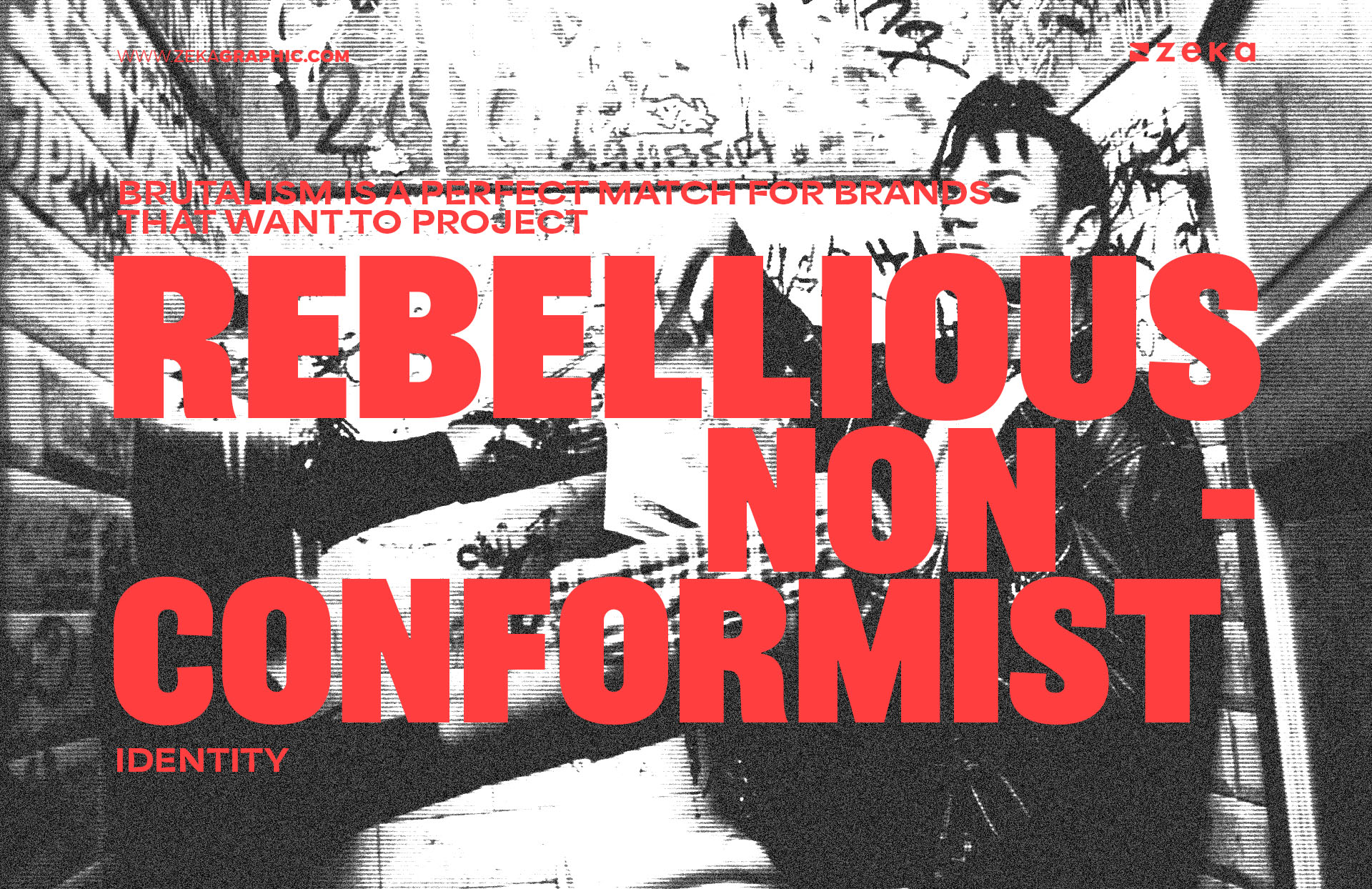
Brutalism is a perfect match for brands that want to project a rebellious or non-conformist identity. By using Brutalist design, these brands can convey authenticity and individuality, allowing them to stand out in an increasingly homogenized market.
For rebellious brands, Brutalist design sends a clear message: “We don’t play by the rules” This makes it especially appealing for startups or indie brands looking to create a strong, disruptive presence. Brutalism’s emphasis on imperfection and functionality over polished aesthetics resonates with audiences who value substance and character over superficial perfection.
Advertisment
While Brutalism on its own can be impactful, combining it with other design styles can yield even more unique results. Mixing Brutalist elements with modern, minimalist, or even retro aesthetics allows designers to create dynamic, hybrid styles that leverage the best of both worlds. Blending Brutalism with smoother, more polished styles can help maintain boldness while ensuring the design remains functional and visually appealing.
Here are some successful strategies for blending Brutalism with other styles:
Start with small Brutalist touches, like using bold type or rough textures, and layer them with more polished elements to keep the design balanced.
Advertisment
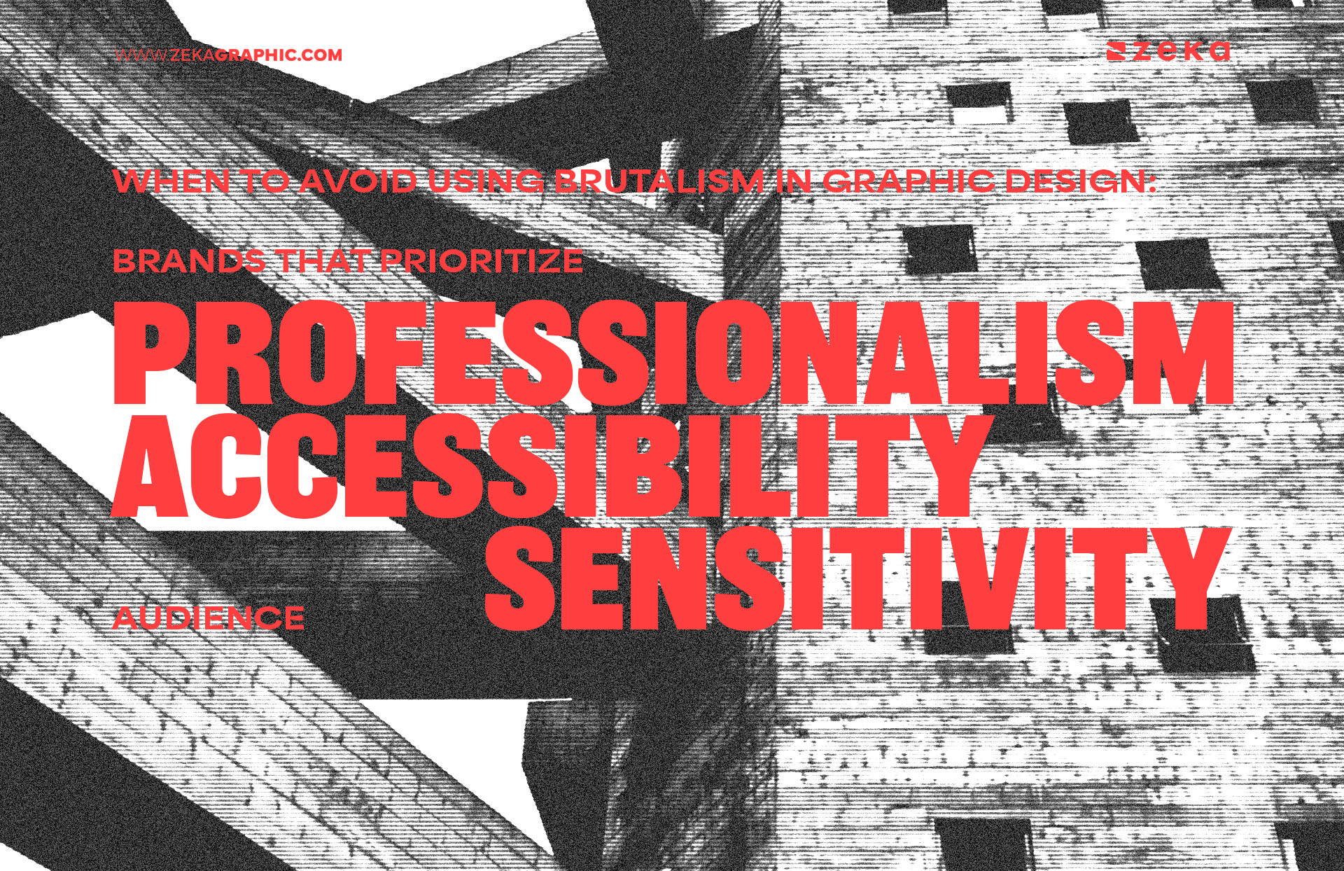
As much as Brutalism can be an effective and bold design choice, it isn’t always the right fit for every project. The raw, jarring nature of Brutalist design can be off-putting or overwhelming for certain audiences and brands, especially those that aim for a sleek, professional, or refined look. If your brand values polish, harmony, and a sophisticated aesthetic, Brutalism may not be the best choice.
Here are a few instances where you might want to avoid using Brutalism:
To avoid these pitfalls, it’s essential to assess the brand’s identity and audience preferences before diving into a Brutalist design. Ask yourself: does this style align with the core values of the brand? Does the audience respond well to edgy, unconventional visuals? If the answers lean toward a more polished, traditional approach, it might be best to explore other design styles.
You can still integrate small elements of Brutalism into projects—like bold typography or slight asymmetry—without going full-on Brutalist. This allows you to experiment with the aesthetic while keeping the design accessible and appropriate for your client’s needs.
Advertisment
Brutalism in graphic design offers a refreshing departure from polished, overly-refined trends. Its raw, unapologetic aesthetic can help brands and designers stand out by embracing imperfection and focusing on bold, functional design elements and also provides an opportunity to challenge conventional design rules and create something memorable and impactful.
If you’re ready to break away from the norm and embrace something bold and rebellious, Brutalism might just be the style for you. Don’t be afraid to experiment with rough textures, bold typography, and unconventional layouts—Brutalism is all about pushing boundaries and exploring new creative territory. Dive in and see how this unapologetically raw design style can elevate your next graphic design project.
Advertisment
Pin it for later!
If you found this post useful you might like to read these post about Graphic Design Inspiration.
Advertisment
If you like this post share it on your social media!
Advertisment
Want to make your Business Grow with Creative design?
Advertisment
Advertisment