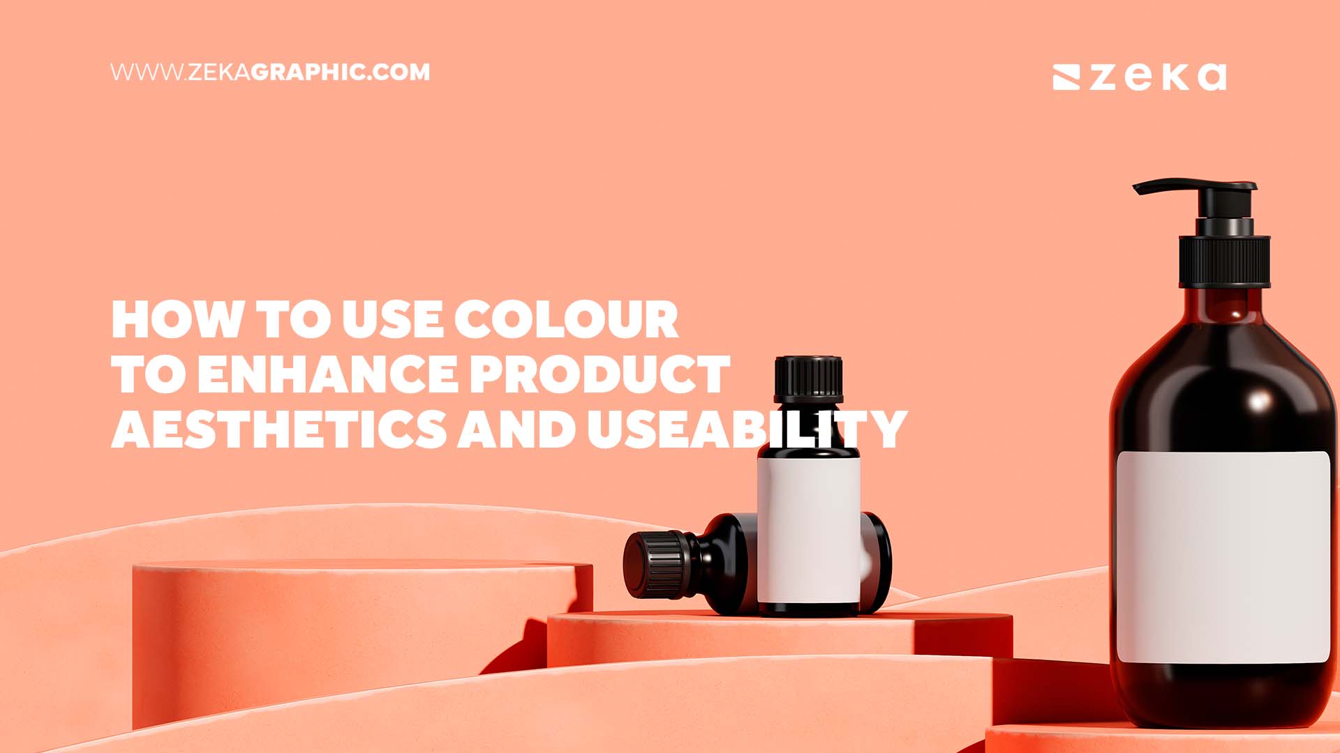
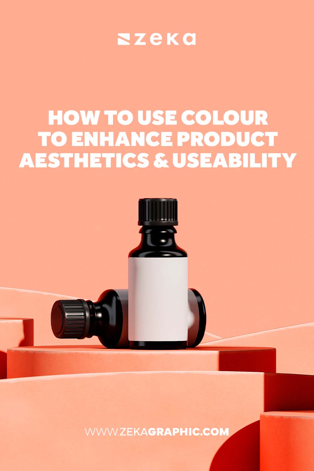
In product design, colour plays a crucial role in shaping both aesthetics and useability. Colour influences consumer perceptions, emotions, and behaviours. A well-considered use of colour also enhances the visual appeal of a product, which makes it more attractive to potential buyers. Additionally, colour can guide user interactions, improve navigation, and ensure accessibility.
For product developers and designers in New Zealand and around the world, they have an opportunity to integrate colour into products and designs thoughtfully. They can develop a product design NZ residents will consider aesthetically pleasing and highly functional. Particularly, they can leverage colour psychology to build a strong brand identity, create a memorable user experience, and drive purchasing decisions. That’s why it’s critical to understand the strategic use of colour and its significance in how products are perceived and utilised.
In this article, we’ll explore various ways to effectively use colour to enhance both the aesthetics and functionality of your products.
Advertisment
When it comes to using colour to enhance product aesthetics and useability, it all starts with colour psychology. This delves into how colours influence human behaviour and emotions. With different colours, they can evoke different responses. So, it’s essential to choose hues that align with your product’s purpose and target audience.
For instance, red is often associated with excitement and urgency, which makes it ideal for sales promotions and clearance events. On the other hand, blue is known for its calming and trustworthy connotations, frequently used in financial institutions and healthcare services to instil a sense of security and reliability.
In the case of a green hue, it symbolises health and eco-friendliness. That’s why the colour is perfect for products related to organic living and sustainability. Understanding these psychological impacts can help brands connect more deeply with their audience, as well as align with local values and preferences.
A cohesive and meaningful colour palette is integral to product design, so choose a colour palette that reflects your brand identity and resonates with your target market. This means if your brand focuses on innovation and technology, incorporating sleek, modern colours like silver and black can be effective. Consider utilising digital tools to help experiment with different palettes and find the perfect combination. Additionally, remember to be consistent and maintain colour consistency across all branding materials to establish a strong, recognisable brand image.
Advertisment
Another way to use colour when enhancing the visual appeal and functionality of products is through the visual hierarchy. This refers to the arrangement of elements in a way that guides the viewer’s attention in a particular order. In the case of highlighting important elements, you can use contrasting colours to ensure they stand out. For example, using a bold colour for a ‘Buy Now’ button can draw immediate attention, which prompts user action.
Moreover, employing darker or more vibrant colours to emphasise key areas while using lighter shades for background elements can prevent distractions and keep the focus on crucial components. Through these techniques, you can lead users through your product interface in an intuitive and engaging manner.
It’s also a good idea to highlight key content with colour for effective communication and user engagement. Use bright or contrasting colours for call-to-action buttons to increase their visibility and click-through rates significantly. In the case of primary content, such as main messages or offers, differentiate them from secondary content with varied colour intensities or hues to help users quickly identify and focus on the most critical parts of your product. This approach ensures that users can navigate and understand your product efficiently, which enhances their overall experience and satisfaction.
In New Zealand, accessibility in design is not just a legal requirement but a moral one. It ensures that products are usable by everyone, including those with disabilities. Following the Web Content Accessibility Guidelines ensures your colour choices meet accessibility standards, including sufficient contrast ratios between text and background colours. Consider using tools to test and validate your colour schemes. By implementing accessible design practices, you ensure that your products are inclusive, broadening your potential user base and demonstrating a commitment to equality and user-friendliness.
Advertisment
Flexible working practices will allow your business to adapt quickly to market changes. Agile project management methodologies, such as Scrum or Kanban, can accelerate your innovation processes even further.
On top of adopting the said methodologies, you can encourage cross-functional teams to work together on projects. This will diversify thought, which can lead to more creative solutions for your business problems.
Consider highlighting buttons, links, and interactive elements with distinct colours to make them easily identifiable and guide users through your product seamlessly. You can also employ colour coding to categorise and organise information, helping users quickly locate what they need.
For instance, use different colours for various sections or types of information to streamline the user experience. This makes your product more intuitive and efficient to use, which leads to higher user satisfaction and engagement.
Advertisment
Colour is a powerful tool in product design, as it influences aesthetics and useability in profound ways. That’s why designers and businesses must thoughtfully integrate colour to elevate their products. Consider these recommendations when designing functional and visually appealing products. This way, you can harness the full potential of colour to make a lasting impact. So, embrace the power of colour in your design process, and watch as your products become more engaging and successful in the marketplace.
Advertisment
Pin it for later!
If you found this post useful you might like to read these post about Graphic Design Inspiration.
Advertisment
If you like this post share it on your social media!
Advertisment


Want to make your Business Grow with Creative design?
Advertisment

Advertisment