Bold minimalism in graphic design is a modern design style that merges the simplicity of minimalist design with striking, daring elements that gained popularity for its ability to create powerful visuals that demand attention while remaining clean and uncluttered. By combining bold, impactful features with minimalist principles, you can create compositions that are both elegant and eye-catching.
This graphic design style helps brands and designs stand out by delivering a clear, direct message without unnecessary distractions, and the philosophy behind bold minimalism is not just about removing excess elements but strategically using color, typography, and space to create an intentional balance of boldness and simplicity. Let’s dive more in-depth in this style and learn how to master it.
Advertisment
To start, let’s understand what Bold Minimalism is. It’s a graphic design approach that balances minimalistic design principles with assertive, daring elements and unlike traditional minimalism, which focuses solely on simplicity, bold minimalism introduces vibrant colors, oversized typography, and sharp contrasts to create designs that are both striking and clean. The key is to use these elements sparingly yet effectively to maintain a sense of order and balance.
In this style, designers often prioritize visual clarity by stripping down the design to its essentials while incorporating bold features that draw attention through bright accent colors or dominant text, bold minimalism emphasizes clarity and impact without overwhelming the viewer.
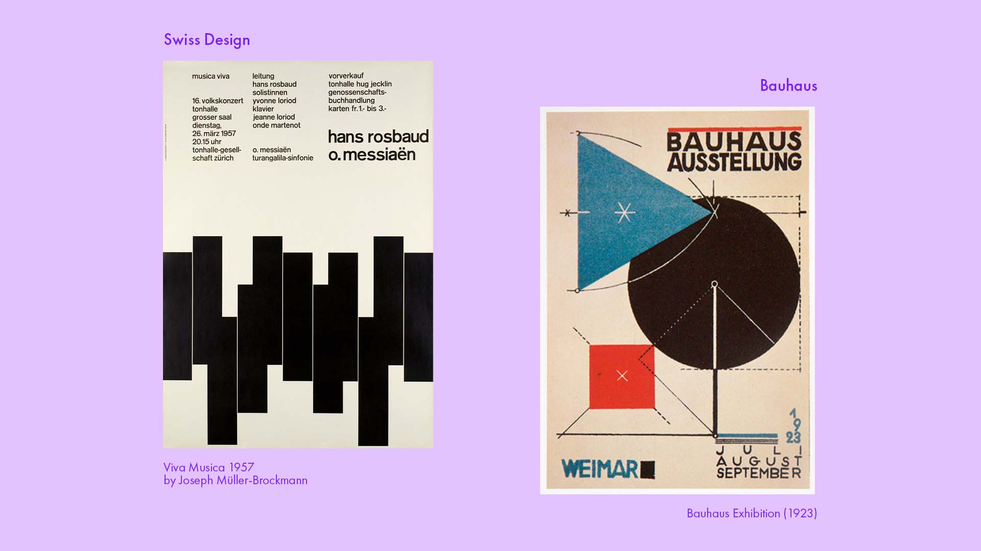
To understand the history of bold minimalism, we first need to know the history of Minimalism as a graphic design style which finds its roots in the early 20th century with movements like Bauhaus and Swiss design, which laid the foundation for simplicity and functionality in design. Bauhaus, founded in 1919, championed the idea of merging art with industry, emphasizing that form should follow function.
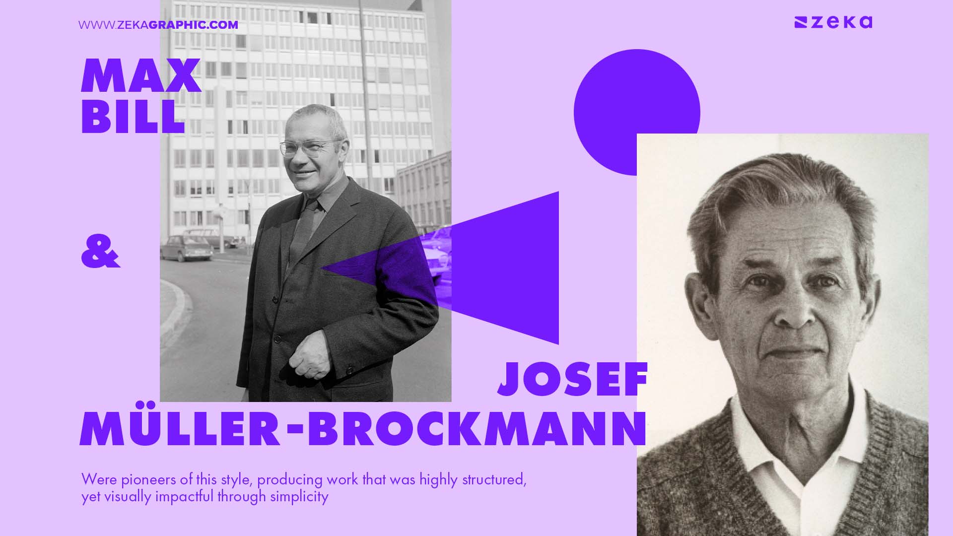
This focus on reducing forms to their essential elements became central to the minimalist design philosophy. Similarly, Swiss design, also known as the International Typographic Style, arose in the 1950s, prioritizing clarity, readability, and the use of grid systems to create balanced and harmonious layouts. Designers like Max Bill and Josef Müller-Brockmann were pioneers of this style, producing work that was highly structured, yet visually impactful through simplicity.
The early phase of minimalism in graphic design heavily relied on neutral color schemes, precise typography, and clean lines. Designers working in this style sought to eliminate unnecessary visual clutter, allowing the viewer to focus solely on the message or product being communicated.
The guiding principle of “less is more” resonated with both print and advertising industries, influencing branding, posters, and editorial design. Designers, particularly during the mid-century modern era, demonstrated that reducing elements could still result in visually stunning and effective communication, proving that simplicity could speak volumes.
In contemporary graphic design, minimalism has evolved to incorporate bolder elements, creating a style that is both striking and uncluttered. Designers today often use larger typography, vibrant color palettes, and striking imagery to enhance the minimalist aesthetic without losing its essence.
Brands such as Spotify and Google have also embraced bold minimalism in their advertising and branding campaigns. For example, Spotify’s branding uses a minimal design layout but incorporates bold, vibrant colors and large typography to communicate a sense of energy and playfulness.
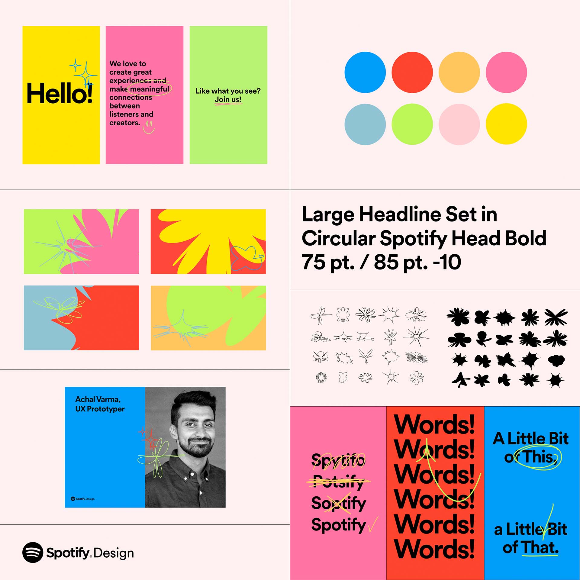
This style has proven to be versatile, able to convey sophistication, creativity, or innovation while remaining accessible and easy to digest for audiences. It’s a great reminder that minimalism isn’t about stripping down to the bare minimum, but about making deliberate design choices that focus on impact and clarity.
Advertisment
As a designer, I often lean into bold minimalism when I want to communicate a message with clarity and impact while keeping the overall design clean and focused, but, how can you identify this style?
Here are the key characteristics of bold minimalism:
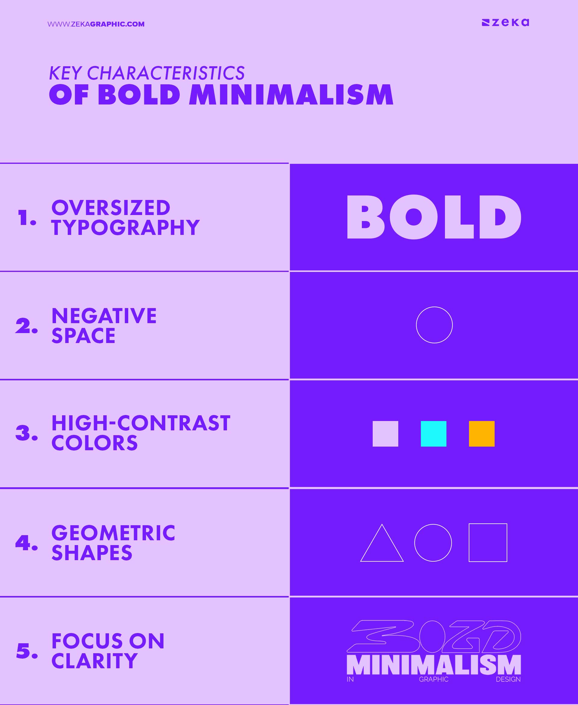
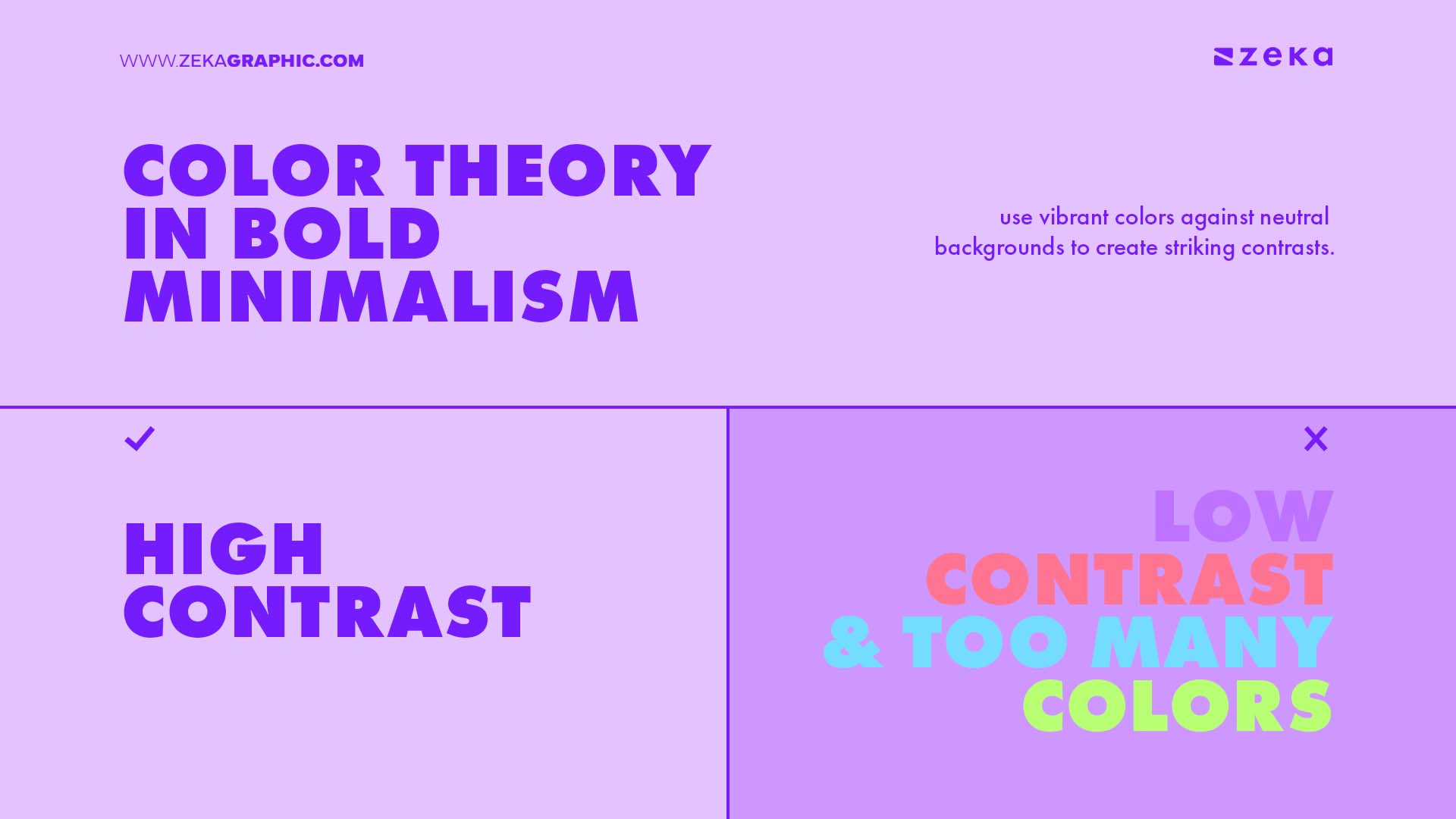
Color plays a crucial role in bold minimalism as designers often use vibrant colors against neutral backgrounds to create striking contrasts. This approach allows the bold colors to stand out while maintaining an overall minimalist aesthetic. By carefully selecting a limited color palette, designers can evoke specific emotions and guide the viewer’s attention to key elements of the design.
Psychologically, color choices can greatly influence how a design is perceived. Bold minimalism often incorporates high-impact colors such as red, black, or neon shades to create a sense of urgency or importance. Meanwhile, calmer tones can be used to establish tranquility, making the overall design feel balanced despite the bold elements, this is called color psychology and if you want to master it you can read this post.
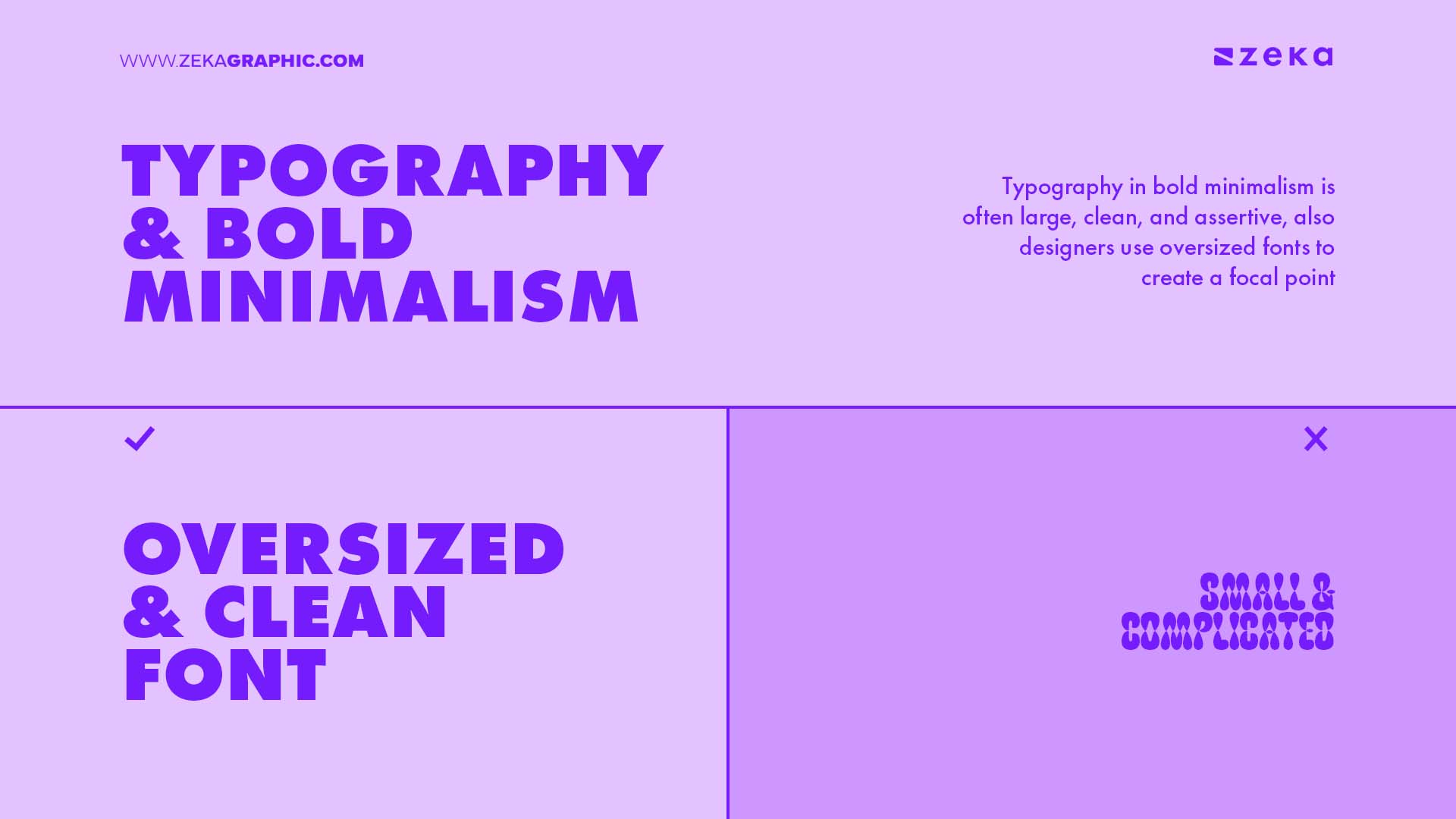
Typography in bold minimalism is often large, clean, and assertive. Designers use oversized fonts to create a focal point, ensuring that the text itself becomes a key visual element. Simple, sans-serif typefaces are commonly employed to keep the design clean, while the size and weight of the font add a sense of impact.
Incorporating bold typography helps maintain clarity and legibility while contributing to the overall aesthetic. When used in combination with negative space and geometric shapes, typography in bold minimalism ensures that the design remains minimalistic while still making a powerful statement.
Advertisment
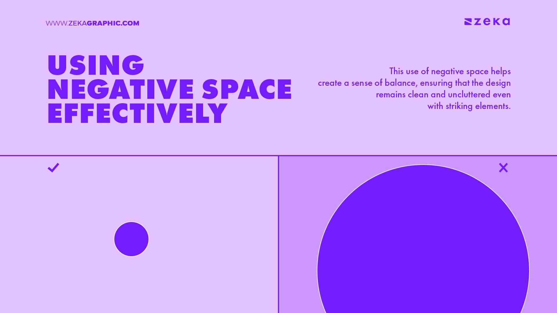
Negative space, or white space, is a critical component of bold minimalism as by leaving large areas of the composition empty, designers can emphasize bold elements without overcrowding the layout. This use of negative space helps create a sense of balance, ensuring that the design remains clean and uncluttered even with striking elements.
Negative space also serves as a visual break, allowing the viewer’s eye to rest while guiding attention to focal points. In bold minimalism, ample negative space ensures that every element has breathing room, enhancing the overall aesthetic and effectiveness of the design.
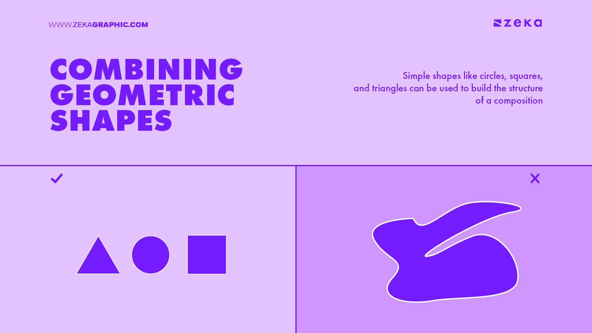
Geometric shapes play a central role in bold minimalist designs. Simple shapes like circles, squares, and triangles can be used to build the structure of a composition, adding a sense of order and visual interest. Designers often rely on these forms to create a strong visual foundation without complicating the overall aesthetic.
Bold geometric elements, when combined with negative space and minimal color palettes, can create striking designs that maintain simplicity. These shapes help guide the viewer’s attention and establish a clear hierarchy within the design, making the composition visually balanced and compelling.
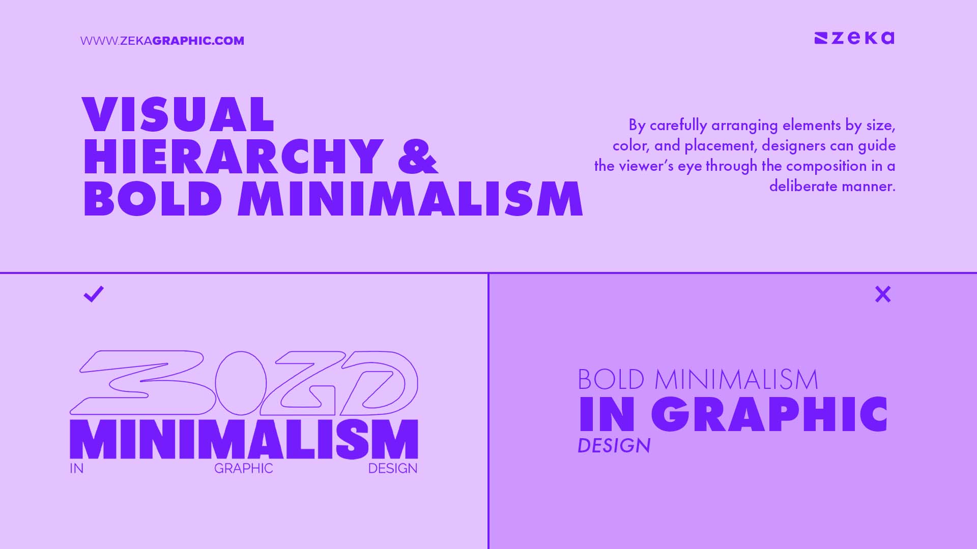
Creating a clear visual hierarchy is essential in bold minimalist design. By carefully arranging elements by size, color, and placement, designers can guide the viewer’s eye through the composition in a deliberate manner. Larger, bolder elements typically serve as focal points, while smaller details or subtler colors act as secondary visual cues.
By controlling the flow of information, designers can create compositions that are not only visually striking but also functional, ensuring that the viewer’s attention is directed to the most important aspects of the design.
Advertisment
Bold minimalism offers numerous benefits in your design projects, making it a go-to choice for brands and designers looking to create clean yet striking visuals. Here are some of the benefits of bold minimalism:
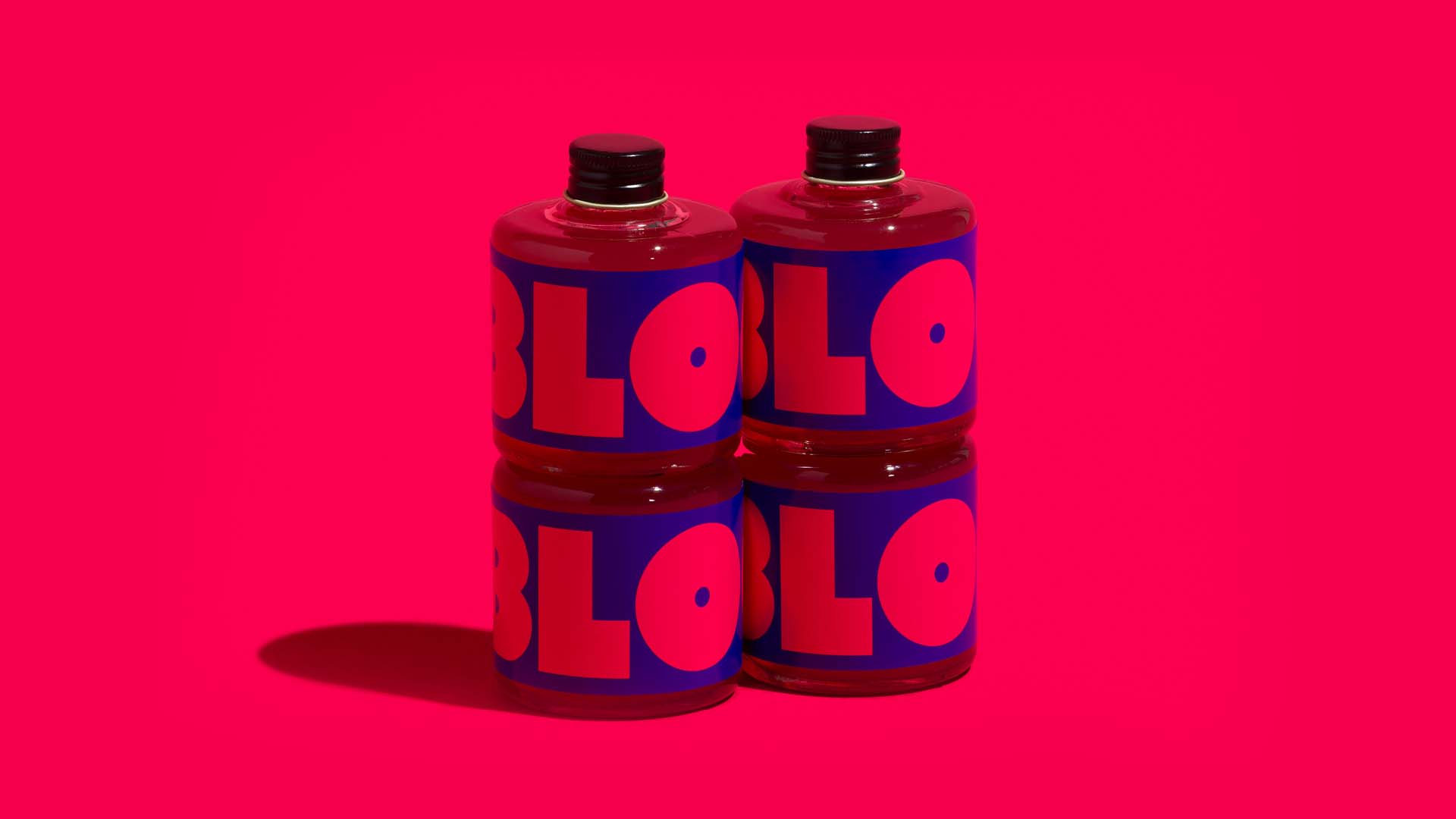
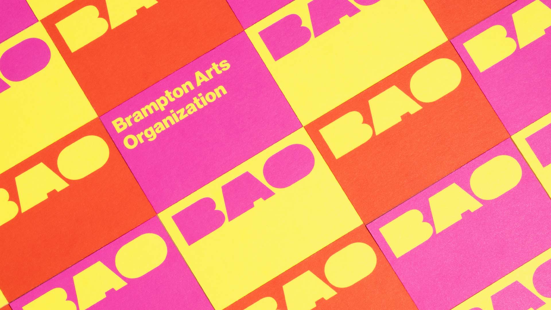
Bold minimalism is frequently used in branding and advertising because it enhances clarity, strengthens brand identity, and leaves a lasting impression. By stripping away unnecessary elements, this style allows brands to communicate their messages more effectively and resonate deeply with their audience. Let’s take a look at some brands that have mastered bold minimalism and the impact it has had on their overall design and messaging.
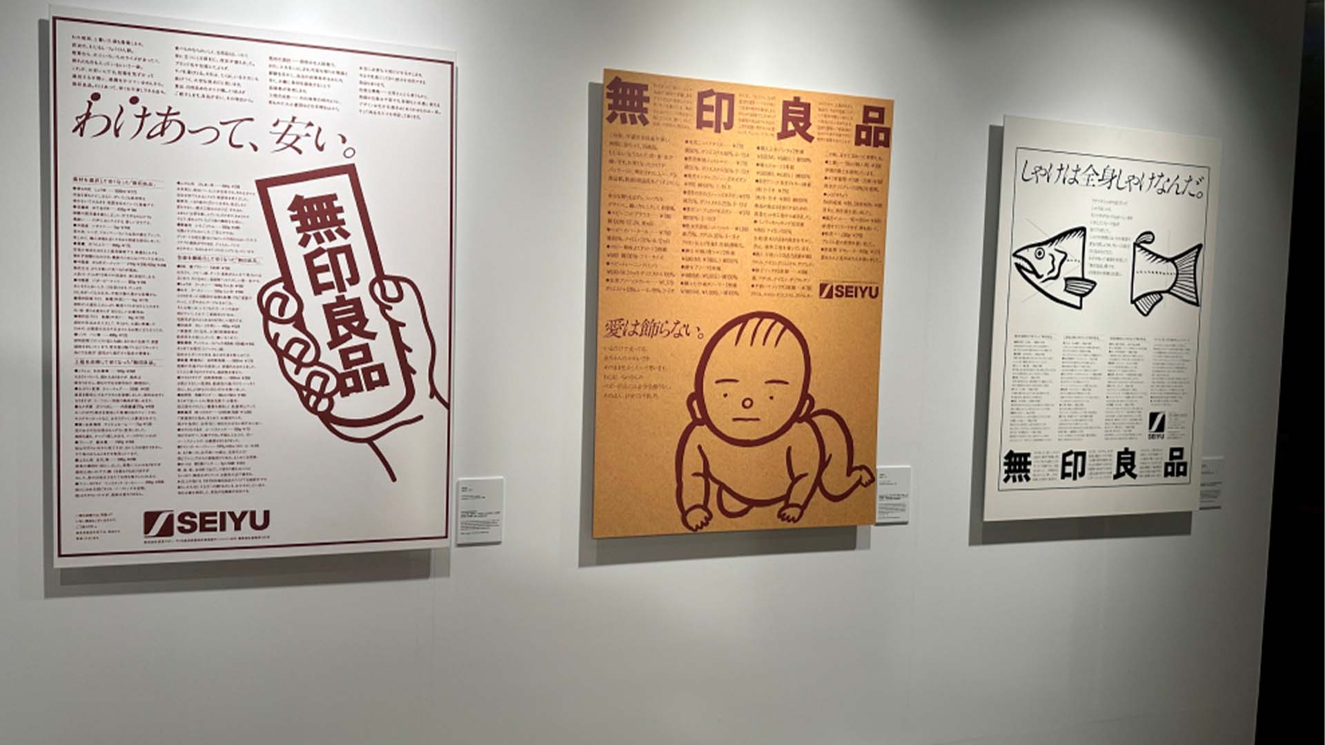
Muji – Source

Spotify – Source
Advertisment
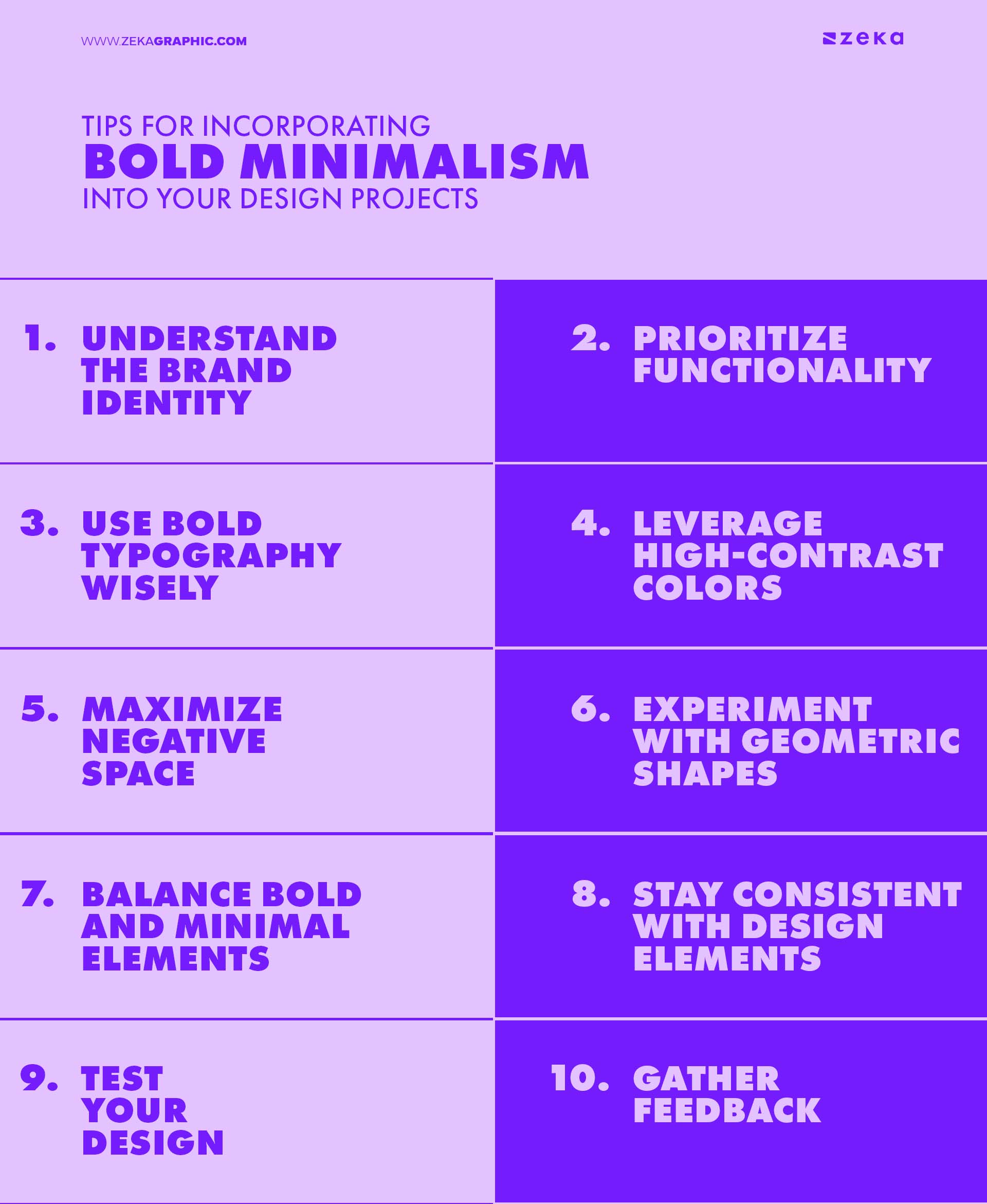
When incorporating bold minimalism into your design projects, it’s important to strike a balance between simplicity and boldness, to achieve it here are some practical tips you can incorporate in your next design project.
Advertisment
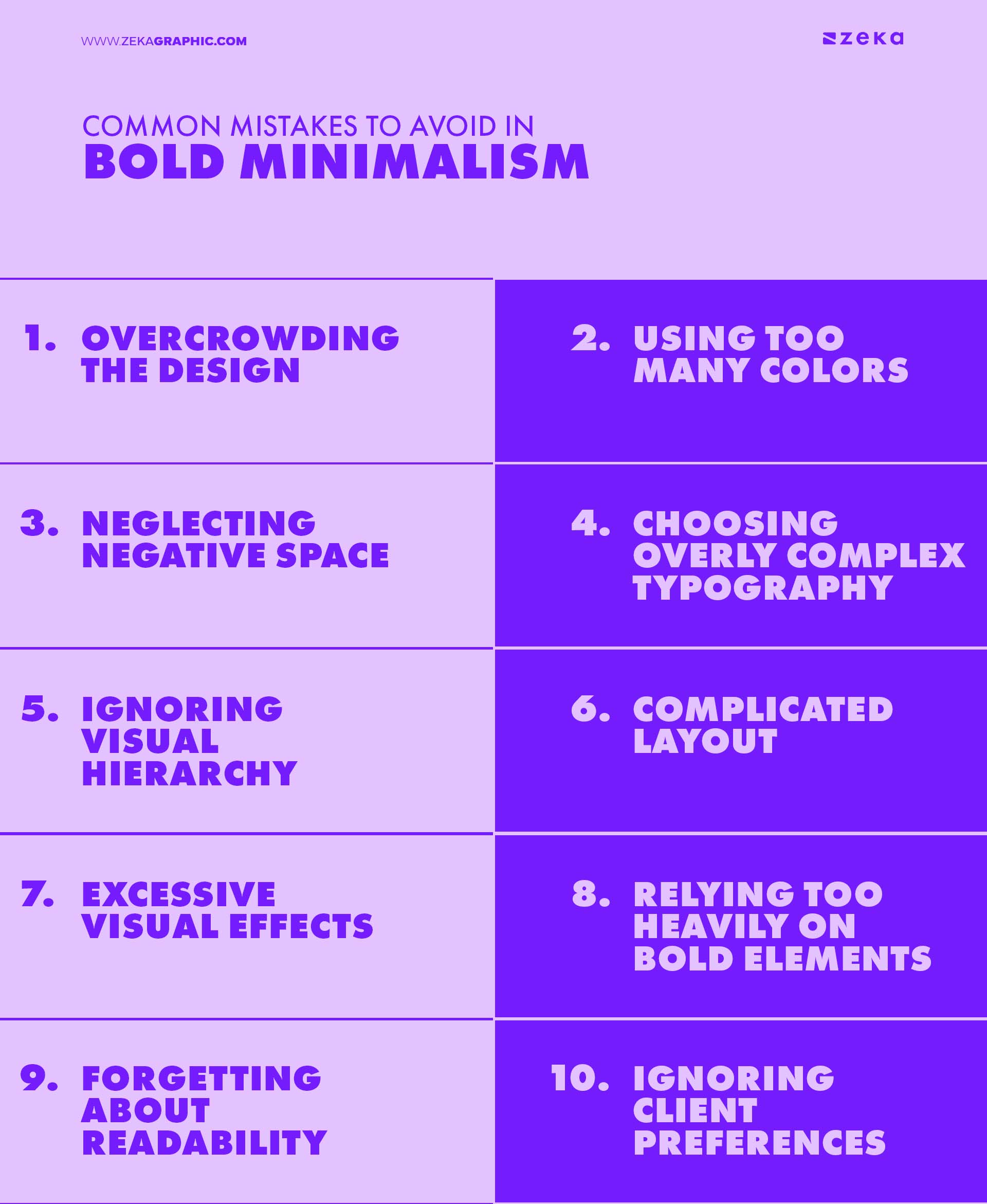
When applying bold minimalism in your design projects, it’s easy to make missteps that can compromise the balance between simplicity and impact. That is why understanding common mistakes can help you avoid design pitfalls and create more effective, visually compelling work, so let’s see these common mistakes and how you can avoid them.
Advertisment
Contains Affiliate Links
If you want to learn more about Bold Minimalism and how to use these principles here are 2 great books that will inspire you!
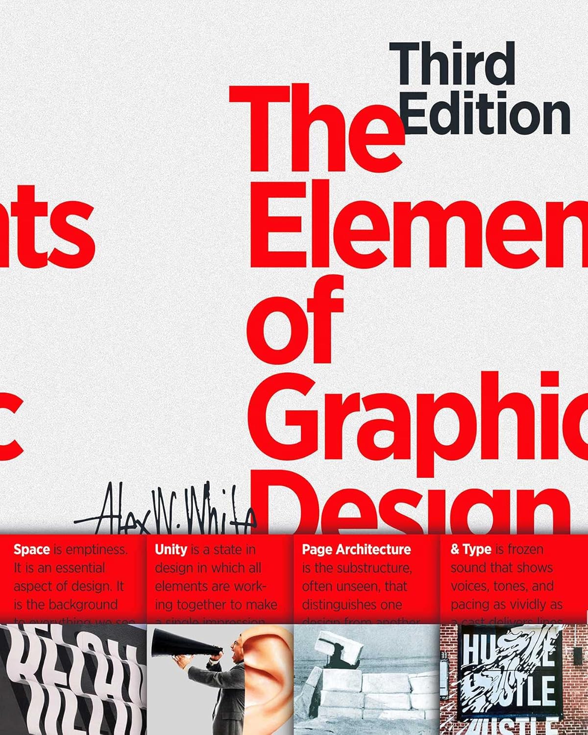
The Elements of Graphic Design by Alex W. White
This book focuses on the fundamental principles of graphic design, including simplicity, clarity, and balance—hallmarks of bold minimalism. It provides insights on how to create visually striking designs by reducing clutter and emphasizing essential elements. Ideal for both beginners and experienced designers, this book serves as a practical guide to mastering minimalist design techniques.
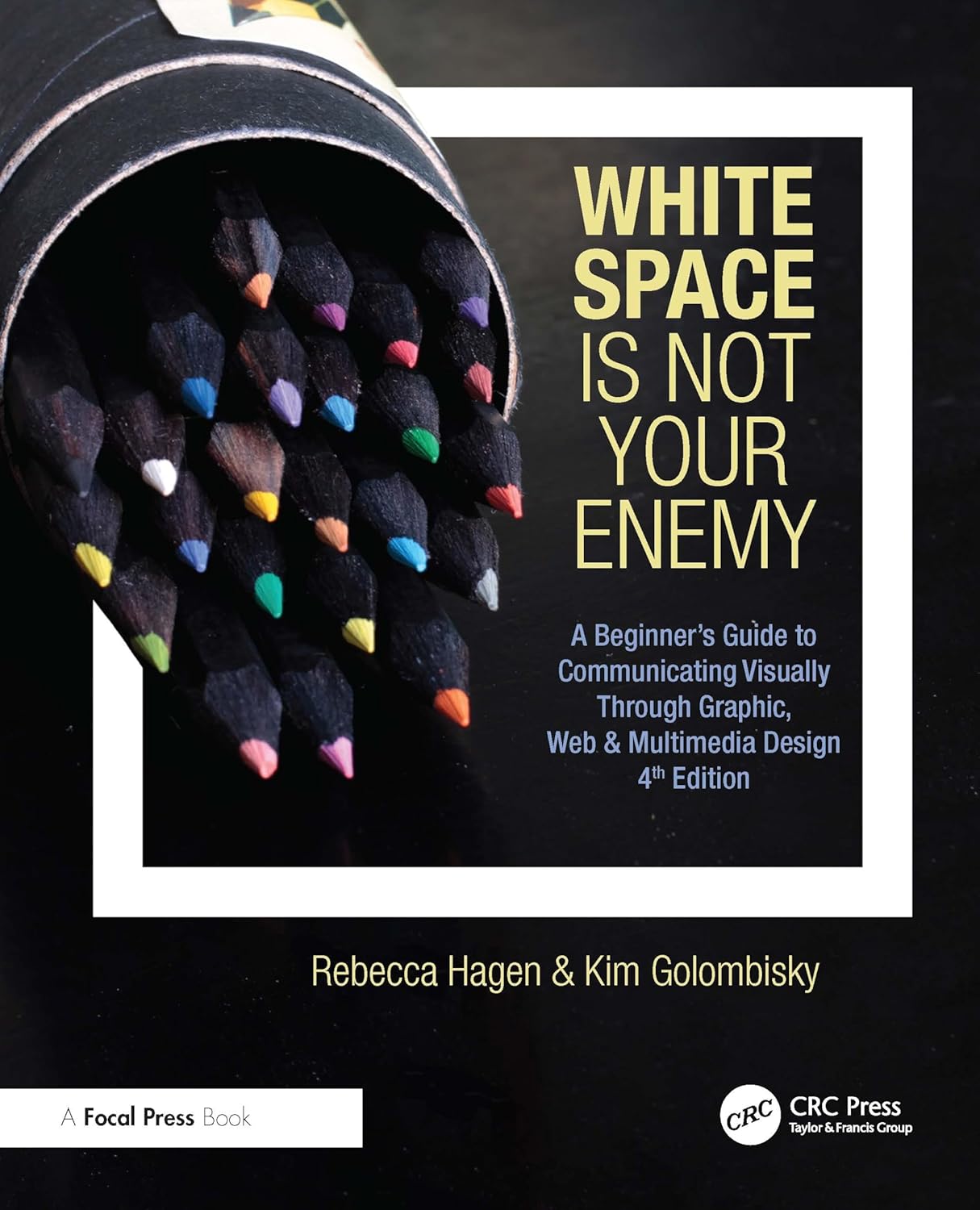
White Space Is Not Your Enemy by Kim Golombisky and Rebecca Hagen
A practical guide to graphic design, this book emphasizes the importance of space, simplicity, and clarity—core principles of bold minimalism. It teaches designers how to use negative space effectively to enhance visual impact and improve communication. With real-world examples and actionable tips, this book is a must-read for designers who want to master minimalist techniques.
Advertisment
Bold minimalism is a design style that expertly combines simplicity with impact, making it a powerful tool for graphic designers. Its ability to create visually striking designs while maintaining clarity and functionality ensures that it will remain a popular trend in branding, advertising, and digital design.
By focusing on key elements like typography, color, and negative space, bold minimalism offers endless possibilities for creating effective and memorable visuals.
For designers looking to stand out in a crowded landscape, bold minimalism provides a unique opportunity to balance creativity with clarity. Whether in branding or advertising, this design style’s ability to communicate powerful messages with minimal distractions is a key reason why bold minimalism is here to stay.
Advertisment
Pin it for later!
If you found this post useful you might like to read these post about Graphic Design Inspiration.
Advertisment
If you like this post share it on your social media!
Advertisment
Want to make your Business Grow with Creative design?
Advertisment
Advertisment